The Obsolete Web Designing Trends That You Must Ditch. Now
When it comes to web design, designers are keen to follow trends and justifiably so. Web designs can indeed help you to make a splash with your website. However, among all the blossoming trends, there are some trends which can – and must – be left behind, as they can prove to be the nasty burns for you website’s prospects.

So, what are the trends that web design industry needs to be shed and shred? What are the trends that are more a sloppy habit on the part of designers, giving users a feeling of distaste or making them cringe and navigate off. Let’s put forth some trends that need to be waved goodbye to.
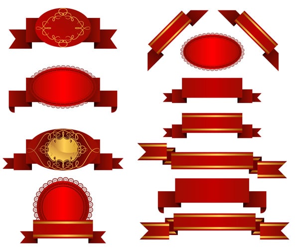
1. The Blinks/Flashes

These sparkling elements were once a trend that dominated the designing world. But, don’t you think you have overused them now? No doubt, these flashes will make even the most “distracted” soul to notice your message. But, they are rather cheese and annoyingly flashy elements that can force your visitor within a fraction of seconds to click on the “close” button and take exit from your website as soon as it pops up. The issues of spam should be dealt with utmost care as it carves out a negative image in the user’s mind to such an extent that even if you are selling miraculously genuine products they will hardly care.
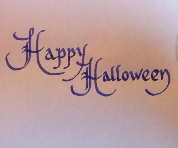
2. Lots of Cursive Text

While creating or updating your website, it’s good to think big but it should be in-tune with the latest trends. By using lots of cursive writing, you are actually pulling yourself to the wrong side of the queue. This is a trend that can actually stands in the way of your website progress, as it makes your site uncomfortable to read and browse, thus end up giving headache to your visitor. It seams as if it’s a trend that refuses to die as web designer or we should say the “novice” once with no design experience often begin with this type of design when it comes to apply some basic designs.
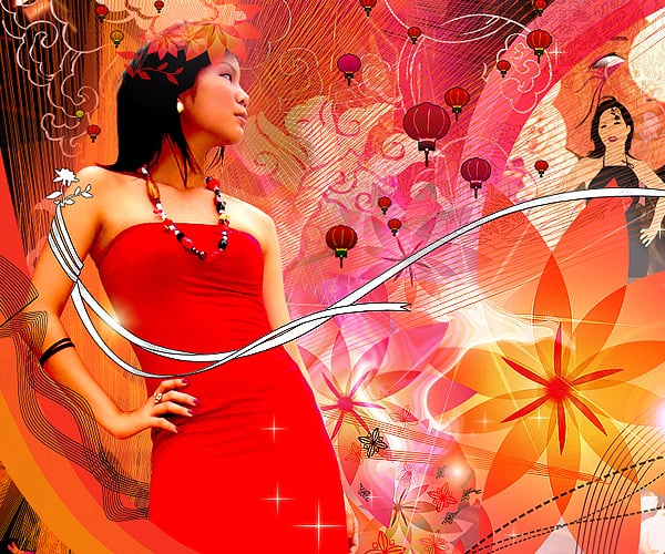
3. No More Burst Effect. Please!

Agree, burst effect is indeed tried and true method to get hold of your visitor’s attention and it renders us great service too, but isn’t the time to let them go? It gives us information about something significant and sometimes insignificant too in an easy and recognizable way. But now the problem is- they look ugly and make your website design more a marketing agent who is throwing his marketing tactics over you.
Such kind of designs lack thought and imagination. And designers who implement them equally lack the skills of integrating break into the designing patterns. It could also be the very first “uncreative” idea cropped up in the minds of newbie designers, who want to experiment with their creativities.
4. Unlimited Number of Pages
If you are running a website with massive amount of pages and content, then it’s time to remove it for good. Websites loaded with loads of pages have become a thing of the past. Designers should make sure that whenever they design a website, they should define the function of each page and determine whether it’s really necessary. The trend has now move to minimalism and over-stimulating your visitor by giving them constant content bombards will leave your website no where. So just stop it now!
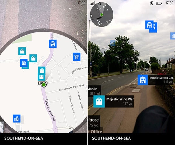
5. Don’t Make the Navigation Challenging

Don’t reinvent the wheel when it comes to developing navigational properties for your website. Innovative navigation designs are fun and they make the design even more challenging, but it doesn’t mean to challenge your visitors as well. Navigations should be at the top of your page or along the side- the reason is quite simple- they look cool and make sense. So, designers should strive to ignore cleverly designed navigations, as it can negatively affect your user’s experience as it boils your website with far so much of a fuss. And, even if you want to make use of icons, designed them in such as way that it should complement the design of your website.
Do This Instead
The above examples illustrate the idea that it’s high time to come out of the fallacy world that makes you think your website is catching eyeballs and turning those into repeat visits. Extravagant and flamboyant design can hold the attention of your users to the point when there is a touch of authenticity is presented into them. Once again, the main principle is to design a style that communicates with your users effectively, and then only you can see yourself on the right track. Due to changes in tastes and preferences, web audience want things to be presented in a subtle and comprehensive manner and for that you don’t have to experiment with overtly done glossy effects.

