

How To Design The Perfect Landing Page For Your Website

Your landing page is one of the most important pages of your website. It will define the level of success that you have in converting visitors of your website into clients, customers, subscribers or even members. Unfortunately, a lot of people don’t pay anywhere near as much attention as they should to the design of their landing page and instead, opt for a bog-standard, boring landing page that likely doesn’t convert at a very high rate.

But the question is how exactly do you design and create the perfect landing page for your website? Well, creating the perfect landing page is never going to be an exact science and the truth is that there’s no such thing as a perfect landing page design. However, I believe that by striving for perfection, you can achieve the best possible squeeze page design and significantly increase the amount of signups/sales/downloads you receive from your website.
So, here’s a few pointers that you need to be focussing on when designing your landing page. If you keep these in mind, it’s likely that your landing page will serve its intended purpose well.
Feature A Bold Headline
When a visitor lands on your websites landing page, you literally only have a few seconds to capture their attention. A lot of the time, landing page visitors will come directly from search engine results and if the visitor isn’t instantly intrigued by what your website offers, millions of other (possibly more suited) results are just one click away. Because of this, you need to make sure that you capture the visitors attention instantly, and the best way to do this is with a bold headline.
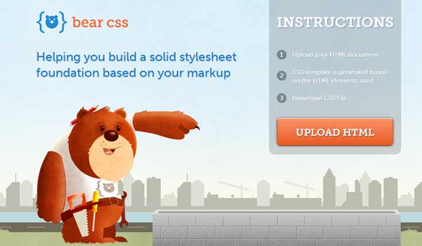
Now, there are two aspects to creating a good headline. First of all, it needs to be bold and it needs to be the main focal point of the website. Your headline is what should attract the attention of the visitor from the moment they land on your website. Take a look at the image above taken from the landing page over at BearCSS.com. You can see that it has a clear and bold headline that reads “Helping you build a solid stylesheet foundation based on your markup”. This will capture the visitors attention instantly and prompt them to investigate further.
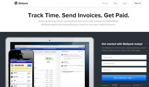
Second of all, you need to make sure that your headline has the right copy. What do I mean by the “right copy”? I mean that it should spark and interest in the visitor and convince them to learn more about your product/service. If you look at the above image from Ballpark, you can see that the headline reads “Track time. Send invoices. Get paid”. It’s a bold, to-the-point headline that will spark an interest in its target market of business and freelance clients.
Feature A Bold Call-To-Action
Your call-to-action is one of the most important parts of your landing page design as it’s the part that actually tells the visitor to take the desired action. Your call-to-action can be literally anything you want it to be, so long as it offers a clear and concise instruction that the visitor will understand.
The thing to remember about your call-to-action is that it isn’t optional. The fact of the matter is that without a good call-to-action, your website isn’t going to see the conversion rate that you desire, so make sure to keep this in mind.
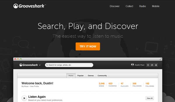
A good example of a call to action is shown in the image taken from GrooveShark above. You can see the “Try It Now” button serves as the call to action as it tells the user to click the button to try the product now (the aim of the landing page in the first place).
You’ll also notice that not only is the text copy of the call-to-action important, but the boldness of it is too. In the image, you can see that the button stands out thanks to its bold use of the colour orange, thus attracting the visitors eye to the button and promoting a click.
Feature A Trust Generation Tactic
It doesn’t matter how much effort you put into the landing page of your website, people simply aren’t going to sign up for your product/service (and certainly not spend their money) unless they have trust in your company.
Now, for a lot of companies, the visitors probably won’t have ever heard of them before and therefore, trust needs to be established between the company and the visitor as quickly as possible through the use of content on the landing page. There’s no doubt that this is a difficult thing to achieve, but there are a number of tactics by which you can do it.
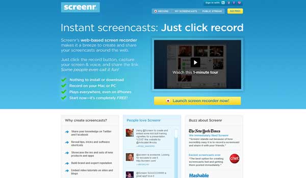
Perhaps one of the most simple tactics is to utilise authoritative organisations as endorsements for your website/product/service. If you look at the screenshot from Screenr above, you can see that around half way down the page, it shows three small snippets of the kind of “buzz” that Screenr has been generating. The clever thing is that these are from extremely reputable and trusted websites (in this case: The New York Times, CNET and Mashable). Just by having these logos and review-like snippets on the page, trust for the product is instantly established in the visitors mind.
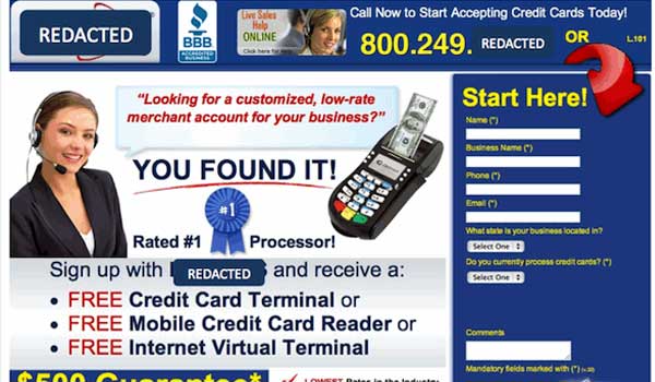
You can also use the design of your website to gain trust to some extent as clearly, a poorly designed website will be unlikely to generate much trust between the visitor and your company. Poor design is a catastrophe for landing pages, which is why landing pages such as the one pictured above are generally a bad idea.
It’s cluttered, badly designed and basically, looks dodgy (no thanks to its overuse of stick imagery). This kind of landing page might have worked in the 90’s, but not now.
Conclusion
As I mentioned at the start of this post, landing page design is not an exact science and nor will you ever achieve the “perfect” design (it can always be improved). However, by utilising the tips presented in this post along with a great product/service and site design, you’re likely to have a huge amount of success with your landing page.
Just remember that you should always strive for improvement. Constantly test other headlines, other colour schemes and so forth.