The Incredible Power of Visual Context in Web Design
The web design is the outer appearance of your business website. It is the face of your online business that has to be impressive, compelling and meaningful. Every website is created for a purpose or cause. An eCommerce website is developed to earn a profit, while a non-government organization would like to spread awareness about a social cause or raise the voice of a community.
To communicate an organizational message effectively and at a glance, the designers are required to develop a visual context in the overall design of the website. A slogan may not be as meaningful as it can be if backed by a relevant image in the background.
For any eCommerce business, a custom web design matters a lot. The default settings, layout, and appearance are not sufficient to convey the message as it needs, that’s why exclusive customization is carried forward. Whether you continue business on PrestaShop, Magento or Joomla, you always feel the need to customize a web page according to the general understanding of a target community.
The PrestaShop product builder module is one of the recommended tools to continue making changes as long as it fulfills user expectations. With the help of such tools, you can better optimize a web design and pursue a visual context that is more attractive, appealing and enticing, and in line with your corporate philosophy.
Visual Context is Attractive
A visual context makes the web pages attractive and appealing enough to create a bond between the website and its users. There could be thousands of websites that will be offering different solutions to a common problem, but you will go with the one to which you relate your struggles. And, this is achieved with the power of visual context.
For example, a user needs to host and manage a website on his own. He faces problem in selecting the right kind of hosting, installing relevant software and configuring plugins to smoothly operate it. Do you expect a common man can do without visual help? Nope. A visual context through images, videos, icons or infographics can tell him how to carry different tasks without seeking help from the experts.
Educating a user becomes easier
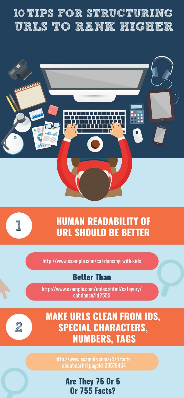
Reading a whole paragraph of text was an old practice. And, you cannot compel them to read it line by line. Why not make it amazingly attractive by creating a visual context through images or infographics? Consider the image below, and you will see how it is creating ease for the end users to read all the tips step by step without getting bored. The visuals are appealing and attractive because it relieves the stress on our eyes in scanning the content.
Visual Context is Significant
The visual context becomes mandatory when you really need the users to stay for long on your website. The users take a millisecond to form an opinion about the design of your website, and then about the nature of your business. They would like to stay longer if they get an idea about your business in the first instance.
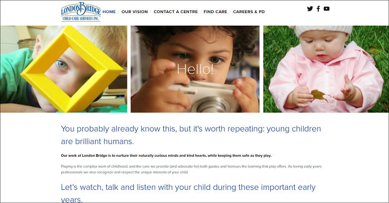
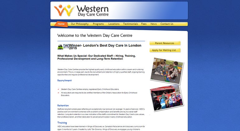
I have tried to compare web design of two difference educational institutes that are addressing users of the same community with a difference in visual context.
Take the example of the first image. When you reach the website, it takes a bit of more time in figuring about the educational values and child care standards of the organizations. A few images are displayed at the right side of the web page, which are aside from the central focus. And, it does not seem to be satisfied for the parents to know more about this institute.
Now, move on the next image. Is not it amazing to have a glance at the alluring images of kids busy in creative activities? The first three images are high quality and clearly visible, which communicates more than a father wants for his kid. It conveys the message of productivity, care, and creativity delivered in this daycare before a visitor can read the text.

By comparing both the images, one can accept the significance of creating a visual context in web design regardless of the type and nature of a business. It creates a good first impression so that the users can find a reason to stay and know more about what you do and how you do.
Visual Context is Compelling
A corporate slogan is not effective until it is accompanied by an enticing and relevant background image. The visual context is incorporated to spice up a message and make the readers not only understand but to trust it as well. It has the power to compel the users to believe the prominent existence of an online business because to place an order they need to trust you first.
Every online business needs to be credible and trustworthy to expand its client base. A startup often fails to gain the trust of its concerned community. Hence, they have to shut down after a year or two. So, whether you start a business from scratch or doing it since long, you need to own a community. The repeat clients may be the result of your valuable services, but to make the first time visitors place an order, you need a strong call to action that is backed by a sense of compulsion.
Here is an example of a quote. Displaying it without an image is less effective, but with the image of its write, who is itself an authority in writing, it proves to be more compelling.
Conclusion
Visual context has a significant existence in the digital world. It removes the understanding gap between a website and its intended users. The power of visuals like images, videos, icons, animations, and infographics combine in a design to make a web page more meaningful, attractive and appealing.
Back in the days, the structure of a web page was mainly designed to appease the search engine robots, so that each landing page gets a higher ranking. But today, the scenario is different. Now, the webmasters are more concerned about the ease and comfort of the end users. This makes the creation of a virtual context a necessary so that they can get to know more about your business and consider making purchases.


