Responsive Typography: Bigger, Brighter, Bolder
Despite the growing trend to visuality and great use of photos, pics and sketches to present data on the web, there is still much about text. Web is still 95% about typography and we still need to read lots of text to get all the necessary information. That’s why typography is still one of the main design elements that requires a lot of attention and thought-out approach.
In responsive web design typography plays essential part. People won’t stay long with the website if they need to strain their eyes to read the info. Responsive typography matters as much as responsive layout structure, customizing images and navigation comfort. And making a text responsive usually means more that simply resizing the text container and refill it with the same text.
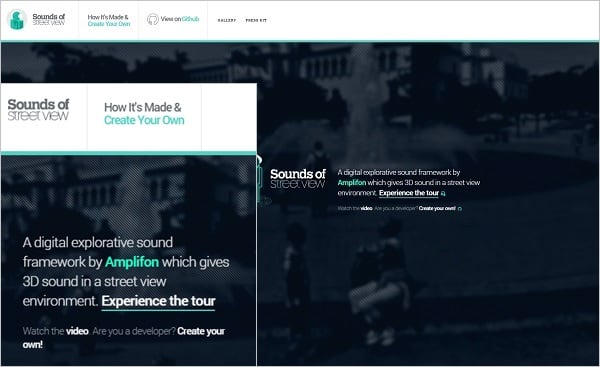
Amplifon
When we speak about responsiveness of the typography we musn’t forget that the case is not only in making the text readable for smaller devices like tablets and smartphones. Your text should look perfect and read well on bigger monitor and laptop screens. Thus, keeping your typography responsive is not just making it bigger. Let’s take a look at the characteristics of the typography you should take into account when designing the responsive website.
Size
Making a text for the mobile version of the website of a proper size is a rule of a thumb. No one wants to feel like Cinderella sorting out lentils when reading a tiny text on a small screen. Your typography should be of good size allowing to read it without any struggle. Of course, the user can zoom in to see the text larger, but it comes out against the idea of the responsive web design. Users should get the text of appropriate size without additional manipulations on the screen. Usually, we introduce to the mobile design a bigger typeface that we have on our regular website.
Palais Thermal
In the example below we see larger font for call-to-action text. However, the headline text was made smaller to fit it into the screen width.
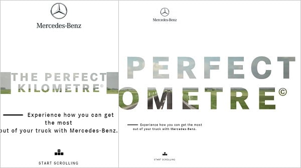
The Perfect Kilometre
Resizing typeface for mobile may be done in a few ways:
- Resize the font with pixels;
- Resize using em units;
- Resize with the use of rem units.
Pixels and ems are more common for designers as they are easy to apply. With pixels you may set the size for most elements in Photoshop. Ems are much more easy to use than pixels as far as they allow resizing the text right from a browser. But they are much more dependent on the parent element and the text’s context so they lose their flexibility in many cases.
Rems are the newest alternative to means mentioned above. It’s main advantage that it applies the font sizing to the entire html document, not its parent element. You just need to set your default html element size and then simply specify the font size in percents for each of the rem units and each device width. The biggest drawback of rems for now is that not every browser supports it so in some cases the setting should be done manually for each element.
Line Spacing and Length
Line spacing as well as the content block width are as much essential for text perception as the font size. Proper spacing between the text lines improves its readability. Adding enough space between the text lines, blocks, headlines and other elements that contain typography helps to avoid crowding and allows highlighting important elements.
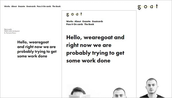
We Are Goat
However, it’s essential to not overuse the spacing and add a reasonable amount of it between the lines and heading. Too much empty space between the actual text and its heading may ruin the design and make reading inconvenient. There are many tools around the web that help determine what spacing is better, but you can also use your intuition to create the spacing that look the best on the device screen.
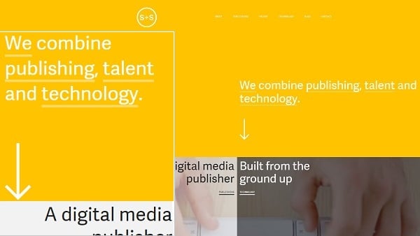
Sydney Stockholm
Line length is another important factor that impacts readability and user experience. Despite the statistics claims that optimal line length is something between 45 and 75 characters, it differs depending on the person. Moreover, bigger font size obviously will put less characters in the line, so if you use large font on a small screen you possibly better to go below the 45 characters level.
Interactions
Another way of establishing the line length is to set a specific width for the area that contains the text. In this case that width may determine the text size and line length. The bigger the font size inside the container will be, the less characters will fit into the line. thus, you may choose between setting bigger font with shorter lines or smaller typeface with more characters in a line.
Paper Tiger
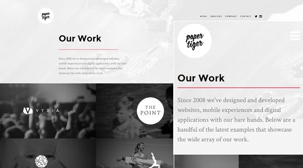
If you design for smaller smartphone screens you may discard the text container and let the text to take all the screen area. However, if you word with larger screen sizes like tablets you may wish to divide the text into sections or columns. It makes the reading easier because the user doesn’t need to move the eyes along the long line and reading becomes faster and more pleasing for the eyes.
Color and Contrast
Color is the key concept for typography that also determines how a person perceives text. There’s no surprise that different colors have different psychological impact to a person and may determine emotions one gets with a certain color.
Colors used for the font should be well chosen as well as the background they used over. The simplest way is not to use contrast color combinations that are usually a great taboo for desktop screens, like bright red with blue or pink with orange.
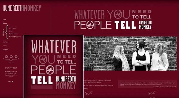
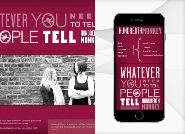
It’s not always possible to set a proper color contrast between the font color and the background hue. Primarily because every user have different contrast settings and contrast may look stronger or weaker on different screens. Sometimes designers apply more contrast or brighter hues for mobile version of the typography to help text perceiving. However, applying some basic principles about color combination and color scheme use to responsive typography is essential.
Hundredth Monkey
Font Type
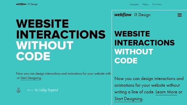
Type of the font is not the most important factor. However, some basic considerations about the typeface choice can be applied to the responsive typography. First, it’s the use of the same font that is used for a desktop version of the website. However, some font types may look poorly on mobile screen.
The main point to consider when choosing a font for responsive web design is whether to choose a serif or sans serif font type. There is an unspoken rule that is used for desktop computers: selecting a serif type for headlines and a sans serif one – for the body text. This rule may be used for mobile devices designing. Most designers choose sans serif types for all text blocks on the site – they look more prominent on a smaller screen while serif elements may merge together and create unnecessary ligatures that will look messy.
Break the Bag Habit
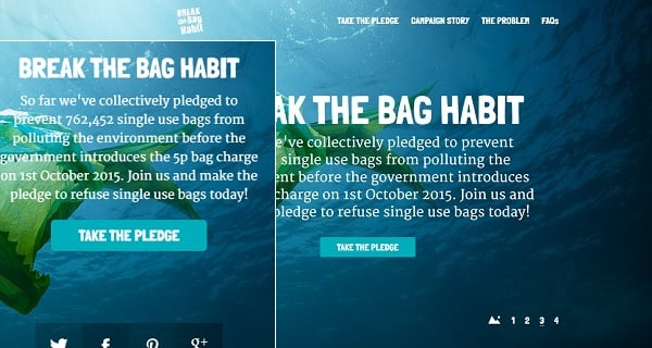
Sometimes it’s reasonable making the text for mobile versions in bold or demi-bold type or using a bit brighter hue for it to make it look brighter and easy-to-read. Italic type is not the best option for body text and is better to be avoided in responsive typography.
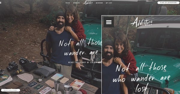
Adventure
A Few More Thoughts About Responsive Typography
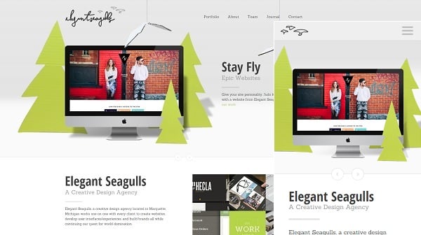
As I mentioned in the beginning, visual elements take over functions of text and typography in modern web. In case of responsive web design, sometimes developers tend to replace some of the website typography elements in mobile version with visuals. Thus, sometimes navigation menu categories or button texts may be replaced with the relevant icons. In the example below we can notice that the mobile versioan removes the text logo of the company and replaces it only with visual image of seagulls.
Elegant Seagulls
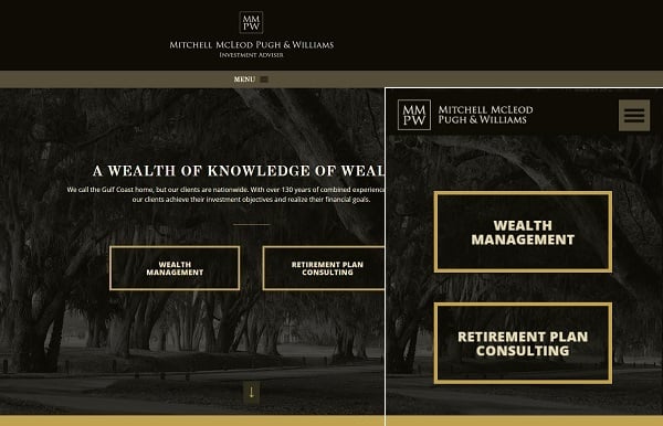
Making a great use of white space is another great idea for responsive design. It allows highlighting focus points and essential elements of the layout and single out navigation elements like menu buttons or call-to-action blocks. The responsive design of the website below removes almost all the text from the Home page and leaves only logo and large buttons.
MMPW
Here are a few more examples of great responsive text and typography website designes.
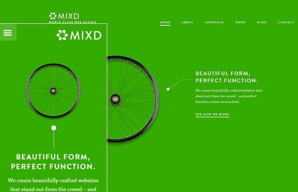
Mixd
This design features enlarged text logo and hidden menu categories while text appears larger and brighter. While the desktop website version displays the visual (a wheel on the left) larger that text, mobile version shows bigger typography.
Syrius Group
The design features a lot of whitespace around text elements that draws attention to them. A button in mobile version loses its frame and focuses just on text.
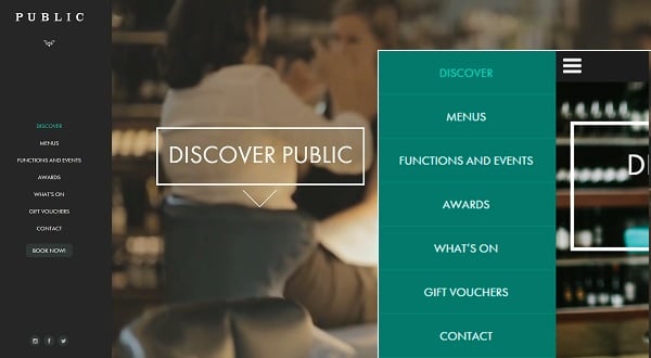
Love Public
Love Public responsive web design pays attention to the navigation menu. Navigation menu typography of the desktop version is less contrast while the mobile version features categories text on a more contrast background what makes it more prominent.
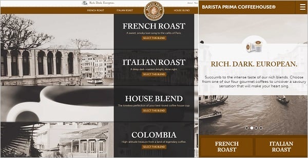
Barista Prima
The following website design is also about navigation menu typography. The mobile design removes all the text of the buttons except the categories titles.


