How to Create Conversion Oriented Design
Funny term is it, not? The old age term called “design is design” now seems to be dwindling and turning on its head and we have this entire cesspool of thoughts and inspirations that keep telling designers what to do or what not to do, how to think, how to be inspired, how to go about finishing a layout, how to go about making a UI, how to understand the customers – this list is endless. Are all of those articles worthless? Hardly but designers need to get this thought firmly embedded; crafting an innovative layout and marketing it are tow entirely different things.

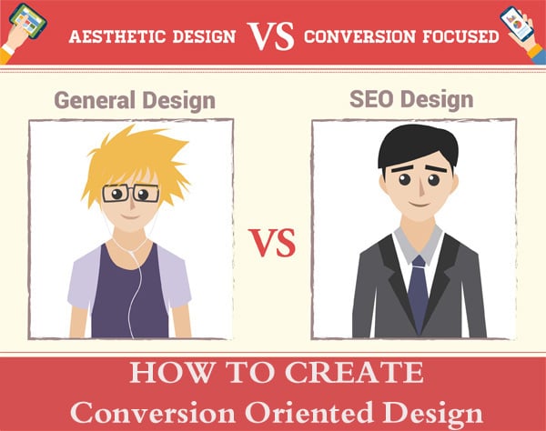
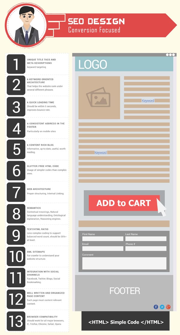
The infographic below should explain to you some of the basic and underlying differences between marketer centered and artist centered design. Once you have set your website aim, you should follow the design tips to make it either visually pleasing or make it boost your conversion rate. Turning your website into a marketing aggregate doesn’t mean you should neglect its aesthetics. Just place the design items on the right places, include calls to action and create a good content architecture.
Infographic Source: Aesthetic Vs Conversion Focused Design
There are enough factors to differentiate conversion oriented design and “general” design:
Catering to a Certain Kind of Individual
Digital marketing is one of the primary tools via which a marketer analyzes the grounds he is trying to claim as his own. It is important for the marketers to know what the visitors are looking for and it is essential to target a website to right personas. In the digital world, personas are meant for visitors who may come to your website’s page through Google or other means.
A website’s layout or a design is hence build to facilitate these personas into accepting the brand and thereby being appealed into buying or trying the product at hand. The options such as ‘Add to cart’ or ‘Info’ are usually enlarged or made prominent. This is done so because you want the visitor to convert into a customer. The persona comes into play when this “selling” element is fused with what the user is looking for. Let’s say you have a website beautifully crafted for visual arts and it gives option to the visitors to subscribe to the artist’s newly written book, then a well placed subscribe floater can persuade them to buy or subscribe to the book.
Adhere to Standards
When we talk about digital marketing, there are certain “do’s” and “don’ts” that are compliant implicitly with the code of ethics within the digital community. “Do not speak ill of brands” , “do not do negative marketing” and “do not use false claims” are some of the general guidelines for beginners.
Now let me set the scene here, a recent project within my company required the remaking and readjusting of the product pages for a website because the header was too large and the prices were not visible. The SEO team’s head pointed out how the menu needed to be pulled down and the price tags needed to be a little enlarged. And these were all pointers which he backed up by numbers on Analytics or SEMRush. The lesson here is how such instances will always arise if you let your design department work in a vaccum, away from the marketers. Ultimately you make those sites to sell and increase your viewership. So these points are a good way of knowing something about the marketing aspect of design.
- Menus should always be visible as soon as the visitor logs to the page. No scrolling, sideways or vertical.
- Header font needs to be readable, larger than the normal text but not larger than the average 50% of the screen (in most cases).
- Do not eat up the the page space with images. Use descriptions, buttons and footers.
- Price tags and categories need to be visible.
- No unaligned layouts.
Dare ‘Outside the Box’
I know, I am saying something different upstairs. But this is important. Your market favors things that are done right and done differently. That is how big brands and giants emerge. From a designer’s philosophy this is where he needs to add aspects that are not convention, not commonly done and certainly not part of the template.
It can be something as absurd as floating “buy” button that is not even “on the page” to something as simple as a button less and image less page. This is purely where your designer’s sixth sense clicks in and he experiments with ideas.
Putting It All Together
Design and marketing are not mortal enemies. Quite the reverse if communication between the two is established in fact. Gradual pushes and changes within the standards are always what has expanded the definition of what is “good” design. Mark this as a recipe and you will have an easier and faster time deploying your designs amongst the SEO from now on.


