Consulting Website Templates for Your Business Efficiency
Consulting business involves close work and interaction with clients on a daily basis. This kind of business is meant for people, so you should offer your customers as much options for connecting you as possible. One of the best ways to do this is creating a website for your consulting company and gain more customers through a strong online presence. In this article, we will showcase you the best consulting website templates that you can easily use to create stunning websites for your consulting businesses.

Websites today play a key role in establishing a brand identity. A huge part of clients look for info about company on the web before deciding whether to use its services. So, a good-looking, informative and user-friendly website is a great promotion for consulting business. When choosing among cool consulting company website templates you should make sure its design and layout meet your goals.
Despite similar characteristics of consulting websites and business sites, there are a few differences that make their designs stand out. Let’s take a look at some of the most important ones.
Raise Emotions with Color Palette
As I already mentioned, consulting business is focused on work with people. So, a user-friendly design is that cover that helps judging your “book”. If we speak about color palette, you may notice that dark-colored or too bright templates are rare because they can distract a user from content.
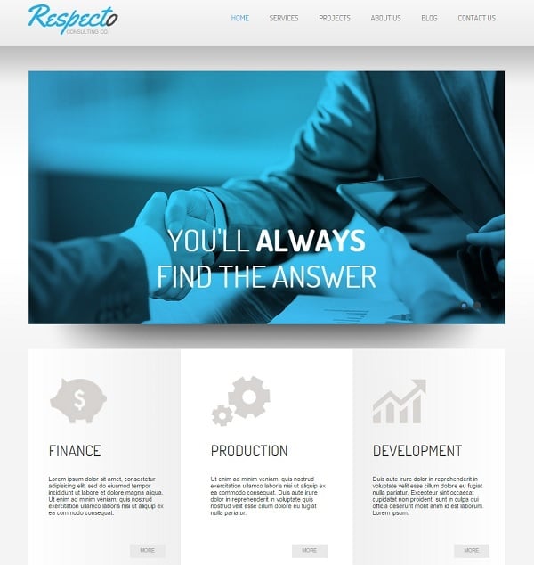
Business and consulting websites mostly use fresh and unobtrusive colors like white, light grey and blue. This trend is easy to explain. Blue is a traditional color for most websites related to business or business services. In psychology it is considered to bring calmness and reduce fear or tension. This color helps to establish a friendly connection with a brand and gain user’s trust. Blue is perfect for consulting business websites that deal with individual customers.
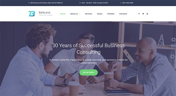
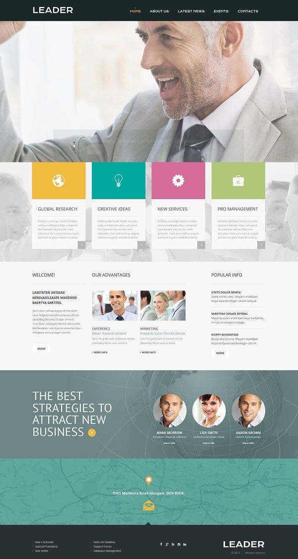
Premium Consulting Website Theme with CMS
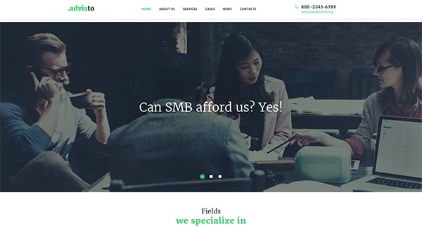
Responsive Website Template For Consulting Business
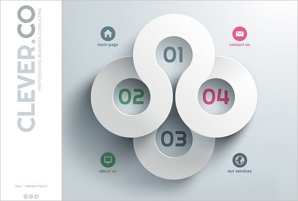
Website Template For Consulting Agency
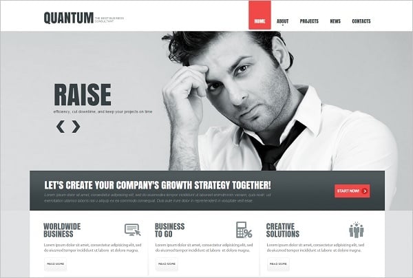
Blue-Toned Consulting Website Template
It’s essential to properly choose blue tone to avoid making your website look too traditional, predictable and boring. You can also combine blue with other colors to create fresh and attractive design palette.
Grey is often considered as an auxiliary color used for less important elements or for a website background. However, if applied wisely, it can become a perfect main tone for a website design. Grey provides a sense of security and intellect thus, it may be considered as a cool color for a business consultant website.
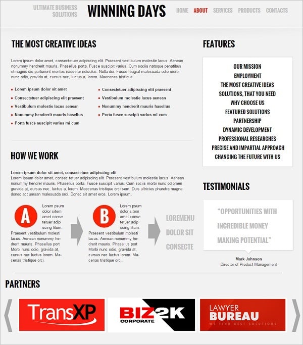
Consulting Business Web Template in Grey
Content-Focused Website Template
However, too much of grey may seem dull and depressing, so it should be combined with some brighter tones as color accents.
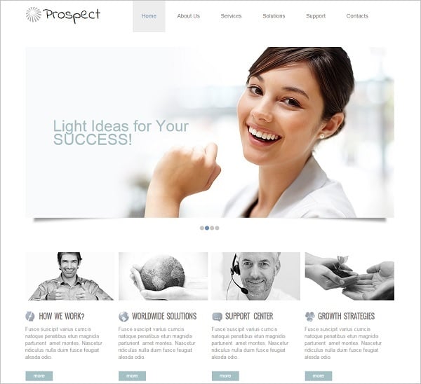
White is a common neutral tone that is used in all website designs. It’s allows highlighting content and brings a sense of purity and honesty. White is one of the best colors for minimalist designs. Clean layout with a few color accents allows placing content in the first place and draw attention to vital info.
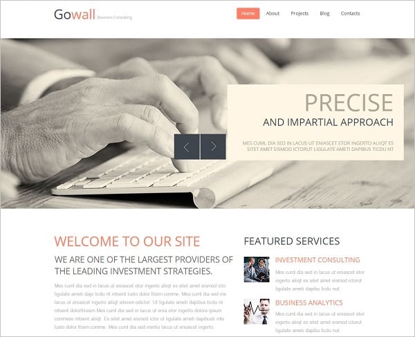
Clean-Style Consulting Website Template
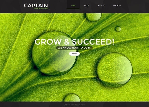
Consulting website created with one of the website templates for business company may benefit from green color use. This vibrant but calming color is associated with strength, growth and energy. So, it will be a cool basic tone for life coach or business consultant who is to help people to succeed.
Web Template in Contrast Tones
Consulting Site Template in Minimalist Style
As for bright colors, like red, yellow, orange etc., they will be good for use in call-to-actions. Such emotional tones attract attention and force people to perform a certain action.
How to Organize Layout Structure
People usually don’t read on the Web. If it concerns a Home Page and the overall website usability, visitors in general scan the page and search for the information they need. In this light, a properly structured layout is extremely important to engage clients.
Avoid Home page clutter and put only important elements on it. Thus, your page should have clear and useful navigation bar, some info about your company or your services, contact phone number. Most users scan the page according to a so-called F-Pattern. In this light you should place more important info on the top left side of the page. Arrange call-to-action buttons or forms in the right corner (top or bottom) to attract people’s attention.
Clean Consulting Website Template
Choose brighter colors and bolder typography for essential elements like your mission, contacts or services list. It helps to draw users’ attention and even may force them to explore more on your business.
Consulting Web Template with Bold Typography
Besides of a Home page your website structure should definitely include About page, Services and Contacts pages. It’s a basic set which you you can broaden with other structure elements if you like. But those four pages are essential for any website and consultancy site is not an exception.
Consulting Website Templates Content
After your design and layout are gathered together, you should fill the website with engaging high-quality content. Design and content should be properly balanced to support each other and serve a common goal.
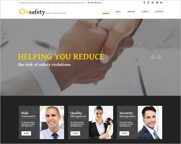
Visual content and photos. Following the idea that people read less today and visuals become more and more attractive and popular, you should carefully fill your website with photos and images. And the main consideration here is: never use stock images! If you wish to engage with your customers, you should show your visitors real people who work with you.
Web Template for Safety Consulting Firm
Post to the website real photos of you, your colleagues and your office. Photos of your working environment also create good markers for your visitors showing them common atmosphere in your company. By offering your clients real photos you can build open-faced and trustful relationships with them.
About page. It should contain exclusive and thorough info about you or your company, your mission and goals, as well as services you offer. Give only truthful facts about you and your team, don’t promise services that you can’t offer.
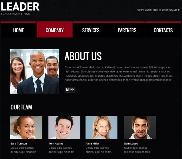
Consulting Web Template in Black
Another wrong approach to About info is giving a flat text full of cliches that don’t describe your company. You should carefully rethink the info you wish to present to your clients and describe your company as a unique team of professionals.
Besides of a separate About page you can provide short and engaging information about you on a Home page. A few powerful phrases that make you stand out of the crowd and reveal your unique characteristics will definitely attract more clients. You should also include a couple of call-to-action phrases that reveal your services. Thus, you can add info about your services to a Home page slider, arrange a bright row of informative blocks under the header or put a bullet list in a prominent place on the Home page.
Consulting Website Template in Pastel Tones
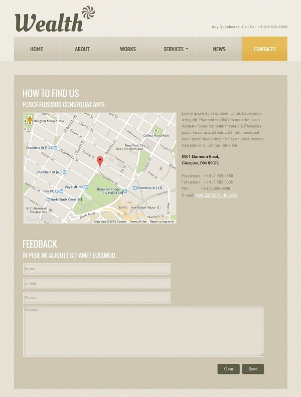
Contact page. This page is essential for consulting website template. You should definitely include a map with your location there to help people from your region easily find you. Contact form should be short and include only necessary fields like name, email address and message. Your email address and phone number should be placed in a prominent area to attract attention in the first place.
Consulting Website Template in Sepia
It’s a wise idea to put your phone number on the top of the Home page and other pages. Another cool technique is making your phone number and email clickable. Such life hack will help smartphones and other mobile devices users to contact you right from your site with no efforts.
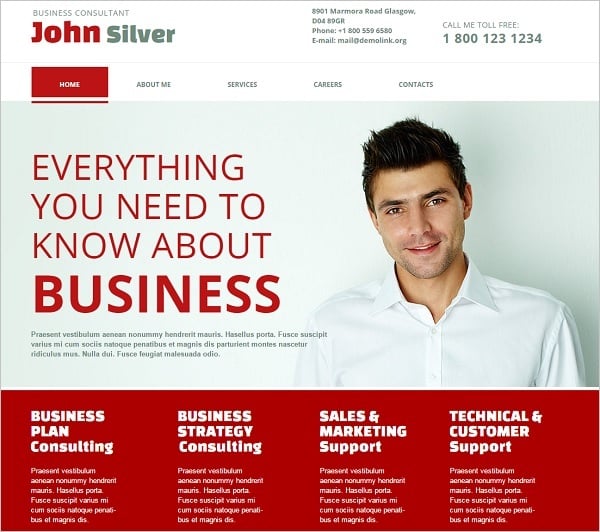
White-Red Web Template for Consulting Firm
Consulting Web Template with a Map
And of course, you should include testimonials section to your website. It’s a popular tradition and very effective technique to reveal the value of your site. Client’s feedback adds value to your business and makes your site more reliable. Don’t post paid-for positive comments and don’t remove negative feedback that sometimes anyone can get. Negative testimonials won’t harm your business but will raise trust to your website. Moreover, negative feedback is a great chance to see yourself from the outside and improve your services.
Consulting Website Template with Bright Accents
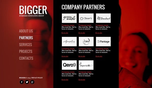
Red-Toned Consulting Website Template
These are the main things you should know about creating your consulting website. Pick a template you like and start customizing it to your taste using these simple tips!


