Understanding the AIDA Approach in Landing Page Design
As the value of digital strategies increases, landing page design becomes a growingly important metric for accessing the overall performance of a commercial website. Namely, landing pages are intended to not only attract a targeted visitor, but also encourage him or her to remain on the page and complete a specific set of actions. Whether the final goal is to lead them to fill in a subscription form, buy a product or book a consultation, landing page design is a factor that significantly influences their decision-making process.

Therefore, when creating a landing page, designers need to focus on functionality and user experience because tweaking this single page can greatly determine the efficiency of a particular campaign. Above all, a landing page needs to have a story that communicates a clear message and directs users towards the desired goal. As a principle that heavily relies on the ways people perceive online pages, the AIDA approach is one of the most widely used techniques for achieving this.
AIDA Approach
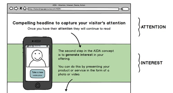
AIDA approach has been used in web design for years and is known as one of the most potent ways to drive conversions on a website. Namely, the acronym AIDA stands for A = Attention, I = Interest, D = Desire, A = Action, which is the exact flow of emotions a user should feel when he or she lands on the page. This way, designers can ensure that a visitor will not only like the page, but will also be motivated for further actions.
The AIDA model is created by both design elements and copy, which need to work together to communicate a specific message and lead a visitor towards a conversion point. Of course, before starting to build a page, one needs to understand the most important factors of conversion in order to anticipate how people would react to specific elements. This way, all the elements can be combined to follow the rules of AIDA, which are explained below.
AIDA Design
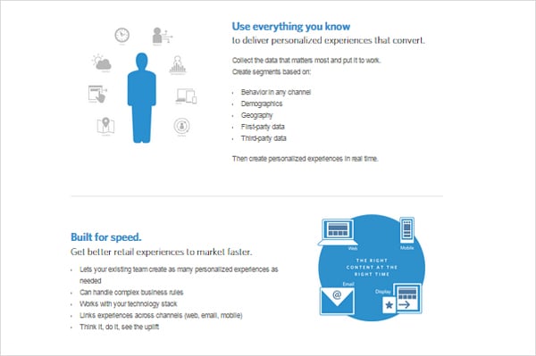
As implied by the acronym, a landing page should contain four distinct yet connected messages. For the purpose of explaining each of them, I’ll take the example of Monetate whose homepage smoothly merges all these.
Attention
The central part of a landing page needs to grab a visitor’s attention instantly and encourage him or her to look for some additional information. This is typically achieved by a short and captivating headline displayed in large, clear fonts to make the initial message pop.

Interest
This part should convey more information on the actual offer or company and include with relevant statements that should support the message given in the headline. The easiest way to evoke interest is to list a set of benefits concisely, so that a visitor can easily read and understand them. Bullet points work excellently here because they summarize the most important information in a readable format.
Desire
Desire simply translates into explaining why a visitor should use/want the particular product or service. This can be done by adding a social proof (in forms of testimonials) or numbers of active and satisfied users. Monetate.com achieves this by telling visitors that their product is used by some major brands, which is supposed to make them feel as if they should try it too.

Action
In the case of Monetate, Desire and Action parts are blended together in order to create an inviting call to action button that is both contextually and aesthetically appealing. When it comes to creating a call-to-action, it should be placed in white spaces in order to be distinguishable from other elements on the page. Bright colors that are different from all the others on the page also help at clearer positioning of this element.
This course gives an excellent template along with the types of contents that should be included in each of these sections.
Of course, depending on the offer, all this can be significantly shorter. Practically, all the elements can be arranged in different ways, which may also be important for campaigns that target specific platforms.
Conclusion
Finally, it should be easy to understand that the AIDA principle is largely rooted in consumers’ psychology, which is why its performance is so impeccable when it comes to triggering conversions. Of course, it’s up to an individual designer to think of the best way to apply these suggestions so that they properly reflect the idea behind the goal, but these pieces of information should definitely help them create outstanding landing pages.


