10 Killer Tips for Combining Fonts Wisely
Typography is a vital element of any website design. You should pay a careful attention to the type and style of font you choose, be it a body text font or a header typeface. The main pitfall of this task is the you usually need more than one typeface. And the worst thing about it is that it’s better to not use one and the same font all around you site. So, you need to learn the wise ways for combining fonts to create a perfect sense of hierarchy, visual style and improve readability of the text.
As with many design elements, the idea of combination is based either on similarity or contrast. Too similar fonts will look boring and the point of hierarchy will be lost. On the other hand, too contrasting fonts will ruin the harmony and make the design look messy. There are no strict rules (actually, like for many things in design) that regulate font combinations. But you should remember some basic things about font pairing to make your website design unforgettable.
1. How Many Fonts to Use?
First you should decide how many fonts you will apply to the website. Despite there is no restrictions on the amount, it’s better to combine two fonts to keep the look simple and sophisticated. With the latest-time trend of minimalist web design, the “the less – the better” idea is topping all charts around the web. Thus, some web design project have only one font around the entire website. If you can avoid boring look or ruined hierarchy, then this approach will be a good idea.
Il Etait une Foret
Epic
Combining multiple fonts may be quite a challenge for you. But if you manage the task properly you can achieve stunning results that add to the website style greatly. Sometimes you may play with typefaces pairing and focus on using multiple fonts with almost no images or other visuals to create a stunning design.
2. Attention to Content
Oh no, there’s no mistake here. You should carefully examine the content’s nature and structure to choose the font or fonts that will deliver the message clearly and be perceived unambiguously. Check out the layout, estimate the headings, sub-headings, categories, comments, block-quotes and sidebar text etc. Try to figure out how many fonts you may need, where you can use the one and the same font, and what to highlight with a different one.
TalkPR
When choosing multiple fonts for the website it’s essential to keep the idea simple and don’t mess up typefaces around the website. E.g. when you use Verdana for the headlines, apply it to headlines of all website’s pages to keep the message clear to users.
Architecture Company Web Template
3. Mind the Layout Hierarchy
As I mentioned above, some elements of the design should be highlighted to grab the most of user’s attention there. It refers to headlines, category titles and various important sections of the website you need to pop up. Consider well where to use bolder and more distinct fonts and where to add a bit subtler typefaces to create a perfect hierarchy.
Surely, titles and headlines need bolder and more distinct fonts to grab attention immediately. When a body text has an intro, you can define it with different sizes or styles of one and the same typeface to create a perfect sense of hierarchy. Just make the difference and roles of each font distinct so users could clearly identify each element with a quick look.
Obakki Foundation
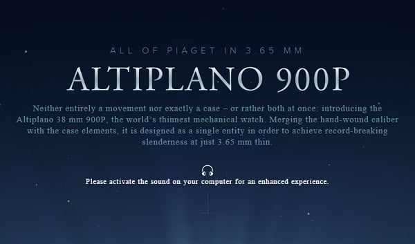
Piaget
4. One Family Is Good
Like in real family, fonts of one typeface family usually share similar characteristics but different temperaments, likes and attitudes. Harmonious families live in balance and allow all the members to develop that way they want keeping the family traits distinct. Fonts of one family make a good combination if the font sizes, weights and styles are chosen well to keep the hierarchy clear. To achieve this effect, go for typeface families that have a great variety of fonts.
Consulting Firm Website Template
Nice Tip: Try to combine fonts created by one designer. It’s like with famous author’s paintings: if you’re a sophisticated art amateur you can easily define the works of Van Gogh or Picasso. The same is with one designer’s fonts: they share similar traits that can make perfect pairings.
5. One Historical Period Is Good
Another cool idea is to combine fonts of different families but created in the same historical period. This idea works perfectly well with vintage websites and designs that tend to some historical styles. Choose fonts that were made in Victorian era or used in Art Deco works of the beginning of the XXth century.
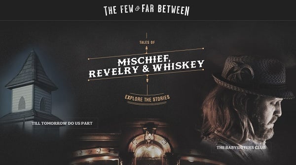
Jack Daniels Barstories
6. One Classification Is Bad
Fonts of different families but of the same classification can easily mess up when used together. Such fonts usually have distinct characters that suppress each other and may create a messy design.
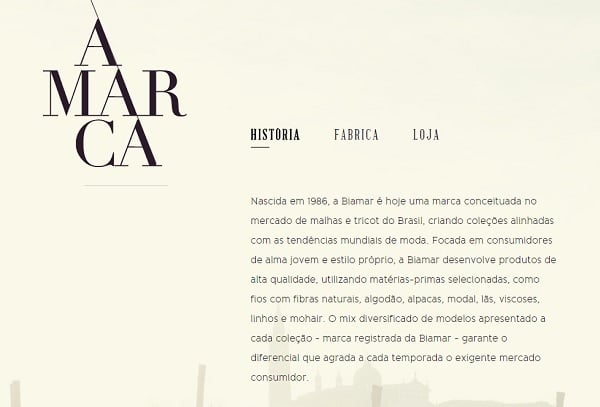
Biamar
7. Combine Serif with Sans Serif
Serif fonts are usually perceived as classic, everlasting fonts that are easy to read. Due to such characteristic they are often used for large text blocks of posts and magazine articles. Sans Serif fonts (“sans” is “without” in French) got such title because they don’t have those tiny strokes (serifs) we can spot in Serif typefaces. These fonts are usually considered as bold, clear and modern. Thus, they are mostly used for instructions, headlines and short text passages.
Pairing Serif and Sans Serif fonts is a sure-fire way of achieving a cutting-edge and sophisticated design. Choose two typeface families from each type with a great variety of weights that assure you will have plenty of options for pairing.
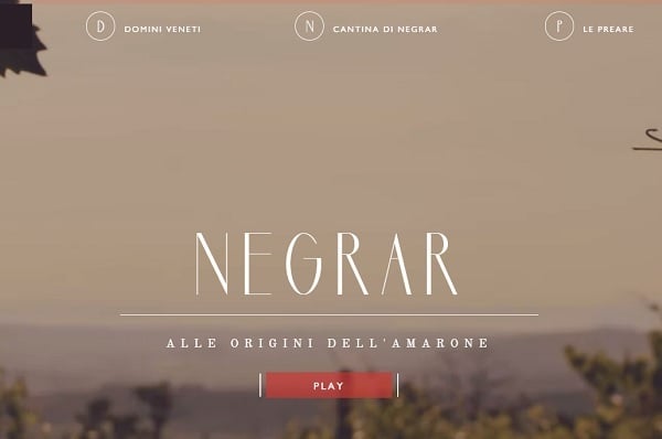
Cantina Negrar
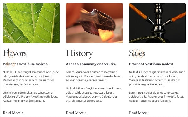
Nice Tip: If you feel combining Serif and Sans Serif fonts can be a tricky task, you can use a so-called AGE technique. It means that best combined fonts are with similar lower case letters “a”, “g” and “e”.
Hookah Website Template
8. Find the Font’s X-Factor
It’s a simple technique that require you to choose similar font sizes according to the size of a lower-case “x” of each typeface. This letter is a perfect means for measuring font height as it has even lines on top and bottom. Just set the fonts you want to combine at the same size (e.g. 14 pt.) and compare their “x”-height. This aspect, not the font size, should affect your font choice.
9. Consider Shapes, Slants and Strokes
The way the letters of the font are drawn is also vital for good font combinations. Estimate how the lines are shaped, are they extended more vertically or horizontally. Compare the slant they have (to the left or to the right) or do they have no slant at all. Fonts with similar characteristic tend to combine easier.
Monday Music
Photo Portfolio Web Template
The font weight (regular, bold etc) also plays a crucial part in fonts combination techniques. Playing with a variety of different font weight you may create a stunning effect and add to hierarchy.
10. Mind Color and Texture When Combining Fonts
Color is the best way of attracting attention and highlighting vital aspects. Choosing various colors for fonts may do real magic to the design. You can create a perfect distinction between two pretty similar fonts only with the use of proper colors or textures. And vice versa, very different typefaces can get a unified look if the same color is applied.
Blloon
Frames Collection
When choosing typefaces and fonts for your website you should bear in mind that this is more an art, than a science. You should have a perfect feel to create a really awesome design.These tips give you hints on the main techniques that can ease a process of fonts choice and combination. Hope it helps, good luck!


