4 Principles For Great Web Design
Web designers are plentiful but still, exceptional designers are not. There are a lot of web designers out there that still create mediocre websites that truthfully, aren’t that visually appealing.
A lot of these websites actually make it onto the web too. How many times have you visited a well known website and found it hard to navigate or to be poorly designed? For me, it’s countless times and I really don’t see any need for this at all.
Sure, website design is a pretty complex subject, especially if you also get into the coding side of things but there are a few rules that should always be followed if you want to make sure your design is great. So what are these principles? Well, let me explore a few of the most important ones for you.
#1 – Keep Things Consistent
Source: TheNextWeb.com
One of the things that you’ll notice when you visit almost any website is that things are quite consistent throughout the design. Obviously, as I already mentioned, there are a few not-so-good websites in which this might not be true but in most cases, the design is made up of just a few elements.
For example, take a look at the screenshot of the well-known website: TheNextWeb.com above. If you analyse the design, you’ll see that things are extremely consistent and almost minimal in their design approach.
For starters, the colour scheme is consistent throughout the design as every page of the website features the colours red and white. It’s featured in the top navigation of the website and also, throughout the posts (i.e. red is used for the author names).
Not only this, but things are consistent in other ways too. Every page has almost the exact same layout design with the menu bar at the top, the main body content to the left hand side of the screen and a sidebar to the right. This helps the visitor to be able to clearly navigate the website with ease, no matter what page they happen to be on.
#2 – Guide The Eye To Important Aspects Of The Page
Source: Dropbox
Another thing to keep in mind when designing a website is the hierarchy of the design. Essentially, this means making the things that are more important more prominent in the design and the things that are less important, less prominent.
Doing this will help to guide the visitor around the website. For example, if you wanted the visitor to click a particular button, you might make that button larger and bolder than many other aspect of the website. If you wanted to put less emphasis on a button, you might make it less prominent in the design, keeping the colour scheme dull and the font size small.
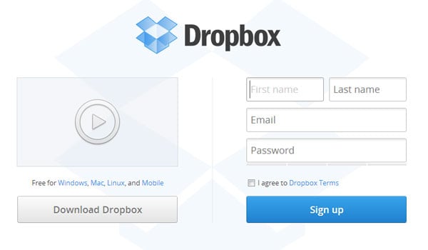
I think the Dropbox website (pictured above) shows this design principle in action rather well. Obviously, when a visitor comes to the website, Dropbox wants them to sign up for their service. Therefore, the sign up form has been made extremely prominent in the design and the sign up button uses a bold blue colour to draw the attention of thevisitors eye towards it.
The less prominent features of the design such as the footer menu buttons are kept small and out of the way. This is to maximise the chances or the visitor doing what Dropbox wants them to do; sign up for the service.
#3 – Use White Space
Source: Microsoft
A common design mistake that a lot of newbie designers make is to try and fill every single part of the website with some sort of content. If you’re looking to create a great design, this is the absolute wrong thing to do as in actual fact, white space is one of the most important elements of any website design.
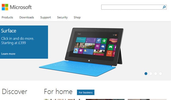
White spaces allows you to separate different elements of the design without any kind of physical division. For example, take a look at the Microsoft website in the image above, you can see that there is a lot of white space used in the design. Without this white space, the design would be completely unreadable and would be hard to navigate for the visitor.
Source: WebpagesThatSuck.com
Compare this with the website for Cloud 9 Walkers (pictured above) and you can easily see the impact that white space has on a website. This website features a crazy background design and has no clear division using white space at all. The result is a cluttered design that is exceptionally hard to navigate and also, was voted as one of the worse web designs ever last year.
#4 – Typography Is Important
Source: SquareSpace
For a lot of designers, it’s all about the actual design of the website (i.e. the layout in Photoshop and the colours used) but one aspect that often gets missed out is typography. Typography is probably one of the most impact aspects of not just web design, but any design for that matter.
The use of typography can make or break a design and ultimately, define whether or not a design is appealing and whether or not it fits in with the brand image.
Think about any website that you ever visit, it doesn’t have the same font or same sized text does it? It’s also likely that different fonts are used on the same page in various different aspects of the design. This is where typography can really take a design to the next level.
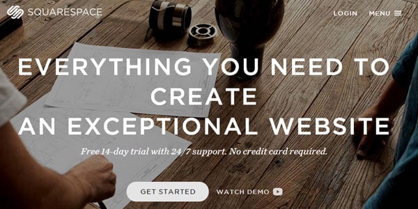
Take a look at the use of typography on the website for SquareSpace. SquareSpace is a website builder much like Wix.com, only it isn’t free of charge. However, you can see how the use of typography contributes to the design. Essentially, it’s the clever use of beautiful, stylish typography that helps portray the site as a classy and innovative product that rivals other free website builders, despite its premium nature.
Now think about if the site design was the same but instead of the fonts that were used, Times New Roman was used instead; it would look pretty diabolical right?
Conclusion
It’s clear that there are a lot of different aspects to great web design and although there are no definitive rules, the principles set out in this post are essentially followed by almost all web designers that are good at their job. They might not realise that they’re following these rules as they might just have a great eye for detail, but they are.
For any designer, these principles should be kept in mind when it comes to any website design project as 99.9% of the time, they can make or break a design.


