7 Aspects of Photo Editing That Web Designers Need to Master
The job of a web designer includes a lot of photo editing nowadays. A good web designer knows how to make a website shine with the use of high-quality photos that help tell a story. Sometimes it’s as simple as needing to resize a photo, but sometimes it goes deeper. Sometimes it’s not possible to get the perfect image during the shoot or from a stock bank. Alternatively, some web designers want to help their websites stand out even more with their photography skills. When this is the case, it’s critical that web designers and top web design agencies know how to edit their photos best and keep up with web design trends.
Photo editing helps web designers enhance the content provided by their clients to make it a perfect fit for their projects. Because humans have visual orientation, both your clients and their audiences need to wow at the photos and visual content on the website you’re designing. These seven photo editing tips will help you do that.
Aspects of Photo Editing – 1. Blurring
No matter what your client sells, blurring will be a really important tool in your photo editing journey. Knowing how to remove background noise and enhance the focal point of whatever the photo shows are paramount to both you and your client. It’s important to know how to use blurring tools. Sometimes a blur will be used to bring visual interest, sometimes, it’s to make something specific in the photo stand out. In the example below, taken from the portfolio website of the Livefront design studio, you can see how tactical blurring gives the impression of a specific store, but the focus is on the new app.
The blur allows you to give background information and feelings without detracting from the main idea. One great lesser-known tool for blurring is Canva. The web app allows you to select what type of blur you’d like to apply to your photo as well as a range of how much to blur a specific photo. This grants a good deal of control and helps you add just the right touch to your client’s website.
2. Cropping
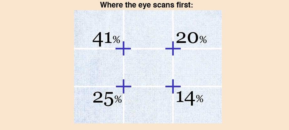
Cropping is one of those understated yet all-important rules that every web designer should know how to use. There are two main use cases for cropping. The first Is to apply the rule of thirds, which allows you to use human psychology to present an image that is visually appealing and interesting. Design Webkit’s Max Therry notes that “Placing items of interest on the thirds of an image is more pleasing to the eye than centering or other more symmetrical approaches.” You can use the rule of thirds to help guide viewers to a specific item you want to draw attention to. Eye movement is not random. Here’s a diagram to show how to use the rule of thirds to direct a browser’s attention.
The other use case for cropping, as known and celebrated by influencers everywhere, is to simply cut out unwanted elements from your photos. Sometimes you have an unwanted photo bomber, sometimes the aspect just isn’t quite right. There are a lot of instances where a handy crop will allow you to create a better photo for your website.
3. Highlights and Shadows
Highlights are a simple and unobtrusive way to make an element pop out, while shadows add richness and depth. Playing with the color balance of an image’s highlights and shadows can be especially helpful when your client has given you a photo that maybe didn’t capture the full tonal range in a scene. In the below example from Digicam Help, you can see two versions of a photo that is too exposed and too dark, respectively.
Your eyes can detect 10000 levels of light, from complete darkness to utter light. A digital camera can only do about half of that. That’s why you’ll often get a picture that is washed out, or the subject is too dark. Luckily, many tools offer the ability to edit the highlights and shadows of a photo. One that is simple and straightforward to use is Snapseed, which is free. Google owns it, so it’s a powerful little app that gives you a lot of control in the palm of your hand. With Snapseed, you can easily fix the shadows and darkness of a photo to bring your vision to life.
Aspects of Photo Editing – 4. Pre-set Filters
No matter what kind of client you have, they will want to be consistent in their imagery and branding. This may feel like a bit of a pain, but it’s actually good news for you. Technology has become advanced enough to allow filters to move beyond the basic photo editing tools that Instagram offered to photo editing tools that are powerful enough to use professionally.
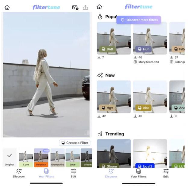
One quick way to ensure that you’re giving your clients content consistent branding is by using preset filters. These filters can be created once and then applied again and again, ensuring that all of the photos for your client’s website look and feel the same while saving you time and energy. Filtertune is one example of an app that allows you to create your own filters and browse existing filters for inspiration.
5. Saturation
Most photo editors know how important it is to increase the saturation of photos. Casual Instagrammers know that bringing saturation adds a level of intensity, warmth, and color to a photo. However, web designers know that saturation plays an important role in both directions. Sometimes adding saturation is necessary. Sometimes removing it is more important. Either way, the saturation levels of a photo affect the mood and energy the photo brings to a client’s website.
Applying saturated colors can be excellent for accents. Removing the saturation from backgrounds can help redirect focus where it should go.
Aspects of Photo Editing – 6. Color Theory
Color theory is remarkably important to web designers. Using color to evoke feelings and emotions plays a vital role in web design, whether selecting a background color or editing the photos that appear on the client’s website. There are a few examples of how to edit photos to play with color theory. The first is the most obvious – using a dominant color to tell a story. For example, you might use the color yellow to indicate warmth and happiness. A web designer can use that knowledge to add a cohesive narrative to the content a client provides.
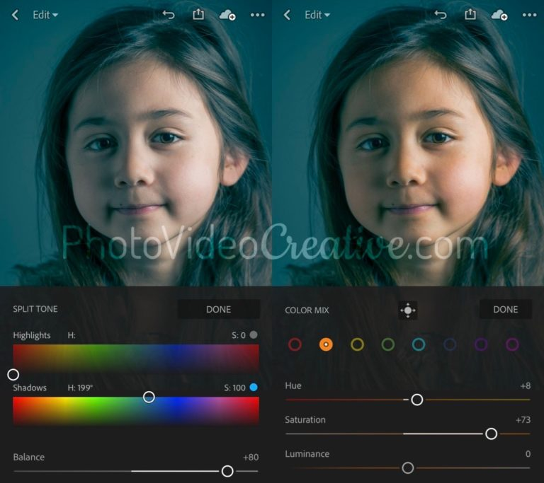
The second is subtler, but no less important: color harmony. There are certain color combinations that are more pleasing to the human eye. As web designers know, it’s important to balance grabbing a viewer’s attention without fatiguing their eyes. Relying on color harmony to edit photos can help maximize that balance. Above, Amaury Descours of Photo Video Creative shares the same shot with two different color harmony schemes applied, exemplifying how the mood shifts as a result.
7. Remove Backgrounds
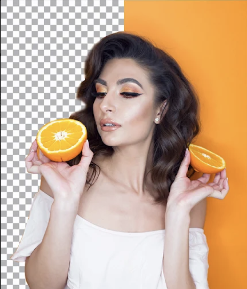
Blurring is one option to address the focus of an image. For a starker approach, every web designer should know how and when to remove the background altogether. Removing the background gives web designers more options – for example, the ability to add a new background altogether or whether to focus on the white space. White space (or negative space) in web design helps balance the different elements of a page and gives users a navigation guide for the website.
TouchRetouch is a great tool focused on background removal. It gives a lot of options, not just removing the whole background. It’s possible to remove single elements (think telephone wires and the like) or remove the background altogether.
Web Designers Who Know Aspects of Photo Editing Will Be in High Demand
Web designers understand that photos play an important role for their clients. High-quality photography matters, but it’s just the start of the intersection of art and psychology that web designers master in order to design a website their clients will love. Knowing how and when to edit the content their clients provide for the website is what separates a good web designer from a great one. Hopefully, these seven tips will be useful to bring web design to the next level.


