5 Ways a Mobile Optimized Ecommerce Website Performs Better
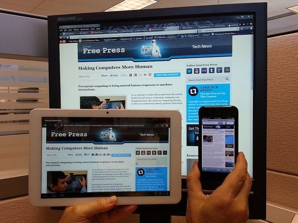
With more than 1 billion smartphone users in the world today, having a mobile optimized site is more important than ever. You may not have considered mobile use when building your site, but as popularity for smartphones grows, people are using their phones and tablets for everything from social media to online shopping. In order to keep up, it’s imperative that your site be optimized for mobile use (preferably via responsive web design). Here are 5 ways you can benefit from having a mobile optimized Ecommerce website.
Lower Cart Abandonment
Mobile shopping is now driving around 15% of online shopping sales globally, and that number is only increasing. It makes sense with this on-the-go lifestyle everyone has these days, but despite using our phones for everything, some people still don’t feel confident entering their credit card information into some mobile sites.
Some people abandon their carts because their information simply doesn’t go through due to some internal issue with the mobile site. By offering a faster, more secure, and streamlined mobile site, people will be less likely to abandon their purchases before they reach the check out.
Higher Customer Conversions
Mobile users are very action-oriented. With the ability to search the web, make a purchase, and find directions all in the palm of their hand, a lagging or poorly designed site can stop a potential customer in their tracks. If someone is on the go and looking for directions to your business or a number to call, and your mobile site doesn’t allow them to obtain that information within just a few clicks, they will abandon your site for something similar.
Better Click-Through Rates
A fully optimized mobile site should also include the ads you feel are necessary, and will make you the most money. In general, a CTR of 0.4%-1.5% is considered pretty good for a mobile platform. To increase this number for your mobile site, it’s best to limit your ad number per page to 3, and position them near the top, or closer to the navigational tools. You also want to make sure the size of each ad fits the aesthetic of your site, so as not to over-power it. Keep a close eye on the performance of your ads, and change them as needed.
Equal Accessibility Regardless of Platform
When designing your mobile site, make sure that it translates across all platforms. You want your site to be accessed by as many people, in as many ways as possible, to ensure that they’re experiencing why your site is better than the rest. Widen your net and include as many people as you can.
Increased Time on Site
When people visit your site, you want themint to spend as much time as possible. By designing your mobile site in a way that is easy to navigate and read, users will be able to spend more time browsing your site for information. By offering interesting, engaging information, or eye catching visuals, you can also ensure users linger on your site, instead of a competitor’s. It is essential for Ecommerce sites to make sure that users feel safe and secure when giving out their credit card information. By spending extra time to perfect the look and feel of your site, users will feel safe enough to give out their information.
As mobile use continues to sky-rocket, it’s important to stay on trend, and make the best decisions for the future of your site.


