15 Usability & Design Factors that Contribute to Website Success
In the present corporate scenario, no organization or business entity can do without a website. A website has come to represent your organization’s front face in the virtual world, and whatever you present on the website makes a critical impression on its users. Therefore, most users scan the website zealously and look out for information pertaining to themselves. Most users take only a few seconds to determine whether the information presented is useful for them or not, otherwise they abandon your site and head off to the next one.
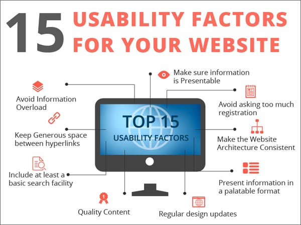
Hence, just a few seconds are enough for your visitors or customers to determine whether your website is capable of offering good service or not. What matters most to make the visitor or the potential customer to stick to your website is how usable the website is to them, or how good the design c is, so that they can really find what they are looking for. Hence, if your usability and design sucks, then it is very unlikely that your visitors will convert into customers despite the high traffic volumes.
In this post, I shall discuss some of the usability as well as design factors that will help you improve conversion factors as well as sales.
Usability (UX) Factors
1. Make Sure Information Is Presentable
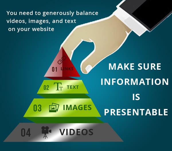
Web users quickly scan your web page looking for any signs of information that they need for their use. If they cannot find it, they will most likely leave. Hence, we need to ensure that whatever information is presented on the website confirms to the way the eye can recognize it. In fact, the eye being non-linear is capable of respond to motion and patterns quickly that responding to text in the same manner. You need to generously balance videos, images, and text on the website in order to present an eclectic mix of content on your website to motivate your customer.
2. Make the Website Architecture Consistent
The more users will pause to think while scanning your web pages, the more questions they could have about the content or their needs. Hence, it is advisable to present the website architecture to them in such a way that makes it easy for them to reach the products and the relevant information. Don’t allow your website to become a maze of links or a hedge of information, which could really baffle the visitor or the customer. Allow them access to information so that they can quickly make up their minds to buy or act accordingly.
3. Present Information In A Palatable Format
At the outset, you should understand that the web medium is different from other media, especially print media. Hence, unlike the trend in print media, wherein long blocks of text are presented to the reader, it is better to present to the web reader short blocks of text with paragraph breaks. Additionally, present images as well as mark keywords in bold, so as to grab the attention of the website user. This is important because the average web user has a shorter attention span than the average print reader.
4. Avoid Information Overload

Jamming a web page with text and images can confuse the reader to the extent that they can become confounded with the information they are presented with. Try your best to follow the principle of simplicity in usability, so you need to refrain from over doing the website with too many graphics such as video and images. Also, include as much white space as possible, as they help to reduce the clustered feeling and information overload. Enough white space helps visitors or customers perceive the webpage content more easily and digest relevant information from them.
5. Keep Generous Space Between Hyperlinks

When you are planning for a desktop website, there is enough space for putting all the links you require. Hence, there is no need to crowd all the links next to each other. Generously include space between links so that the visitor can conveniently click on it without feeling forced to do so. In case you are planning for a mobile website, visitors will use their fingers to access hyperlinks.
Hence, the same analogy applies to mobile websites, because you won’t want potential customers to click the wrong links if these are placed too close to each other. Another usability issue is when the permalinks generated for certain crucial content gets broken, resulting in 301 errors. Avoid this usability issue by retaining the linking structure during design changes for crucial content.
6. Include At Least A Basic Search Facility

Always include a search facility that works. It is always recommended that your website consists of a working search box which customers utilize to search for your products or services. According to recent studies, potential customers are more likely to purchase a product from your store if they can find it in the search results. Hence, the search box is a direct prompt for those visitors who are ‘search-dominant’ in nature.
7. Avoid Asking Too Much Registration Information

Avoid asking to too many registration details. This acts as a barrier to restrict users from registering and consequently placing their orders since users are increasingly interested in efficient and anonymous browsing. Yet another instance is the prevalence of the convention to ask the customers to log in before commenting. Although this may decrease spam, this substantially decreases comments on your website. Yet another instance is the prevalence of long registration forms, which can prove to be a usability issue. Shorten the requirements and replace the long forms with shorter forms that require lesser details.
Design Factors
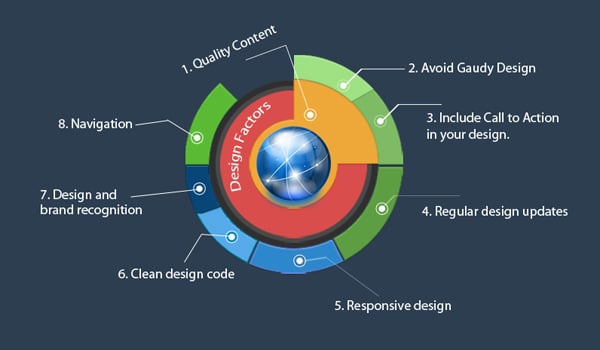
8. Provide Quality Content
One of the main reasons why people visit websites is to view content. Hence, you need to provide worthwhile content online and ensure that it is of high quality. This is because only if the content is worthwhile, will visitors stay back and browse the site further. It should be borne in mind that the quality of the content is equally important for search engine rankings as other parameters. You should understand that it takes longer to produce good content, so will need to allow considerable time for content production for your website.
9. Avoid Gaudy Design
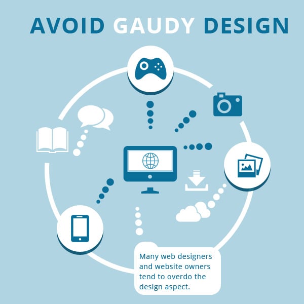
In their zeal to make their design look as splendid as possible, many web designers and website owners tend to overdo the design aspect. Every designer becomes obsessed with design to a certain aspect, however this obsession of certain designers tends to take the website design towards the gaudy side. Hence, gaudy design is best avoided in all circumstances.
10. Include Call To Action In Your Design
Call to Action (CTAs) drive the user behavior to the appropriate action the web designer wants them to take such as buying a product or subscribing to a newsletter. Hence, CTAs are an important parameter concerning lead generation which can be used in most marketing tactics such as emails, social media updates, press releases, etc. Many designers often over look the CTA aspect while spending a lot of time in other design aspects.
For example, the ‘Add to Cart Button’ can be designed orange in color, and be of a large size. Hence, customers looking forward to take a decision on purchasing can immediately locate the button without searching too much for it. In other words, appropriate call to action design compels customers to convert without making them think too much or placing too much stress on their mind.
11. Install Regular Design Updates
Include a plan of action to regularly update your website design. In today’s competitive world, attractive and compelling design is necessary to push up your sales and stay a notch above the competition. Hence, regular design updates help you steal the thunder from similar websites or other online businesses.
12. Go for Responsive Design
It could prove too costly for you to ignore the surge in the use of mobile devices to view websites. If you present critical information on your website and wish that people on the go also view your website information, then include responsive design as your main push forward. Talk to a responsive design consultant as soon as possible to catch the mobile wave.
13. Include Clean design code
Ensure that the code design is clean and follows W3C standards. Simply speaking, your website needs to be free of clutter and standards compliant. This involves the use of tags and structures of the design language, and that these are being used for their intended purpose. Clean code design has become important since the web is an ever changing and ever evolving phenomenon, and the sites that are built using code need to be clean and built according to established web standards, so that they can endure the changes that come every time a new technology or language is ushered in.
14. The Link Between Better Design And Brand Recognition
Keeping in tune with established norms in the corporate world, your design nuances should correspond to better brand recognition in your mission or business. For example, if you are a corporate website, then your design should reflect your brand values and corporate mission and goals, while if you run a news or a charitable website, your brand should reflect it likewise.
15. Navigation
Finally, understand that navigation is a key element of website design. It is a key hinge of user experience and presents an entire roadmap of your website to your customers. Make it stand out enough and avoid making it get lost in massive ocean of content. Its best to keep the navigation bar on the top of the web page, so avoid making users scroll down to other parts of your website in search of navigation.

