How to Create Laundry Website Design: Useful Tips to Be on the Top
Do you run a laundry business and offer your clients fast professional services but still don’t have a website? Frankly speaking, it’s high time to remove this lapse if you don’t want to fall behind your competitors. Fortunately, nowadays even a person with no special tech skills is able to build an effective website from scratch. Believe, you don’t need to hire a qualified pro to create a stunning laundry website design. Everything you need is your desire and several hours of your precious time. Are you ready to make this leap into the unknown? Then let’s begin without further delay!
Smart Ideas for Laundry Website Design
It’s not a secret that the words “to start from scratch” are able to evoke horror in many of us. Sometimes a new beginning seems a kind of “mission is impossible”. That’s why we decided to show you several examples of smart laundry website design ideas. Hope, they’ll become your source of inspiration and make you believe that the mission is quite possible.
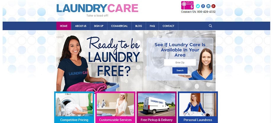
Laundry Care
Laundry Care has created an eye-catching laundry website design that is able to captivate its viewer within seconds. To start with, the company chose clean website background with bubbles resembling the suds in a washing machine when you do laundry. The selected bright color scheme gives the website an energetic and cheerful feel. Moreover, they included a quick overview of all the services on the homepage. So, you don’t need to waste your precious time on scrolling down the pages.
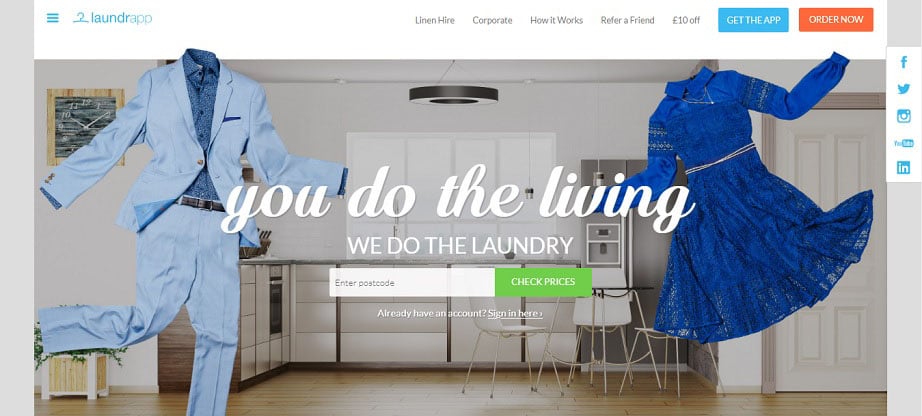
Laundrapp
Laundrapp isn’t only a stunning attractive laundry website with appealing images and useful text content. It’s undoubtedly a great example of using inspirational content in laundry website design. This laundry website is dynamic and interactive. The company enlivened it with embedded videos and animations to keep the audience engaged. Besides, they devoted two of website pages to special offers such as “Refer a Friend” and “£10 off”. No one will deny that these pages are really able to attract new clients.
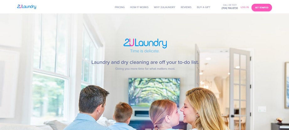
2ULaundry
The 2ULaundry website is a combination of quality content and constant ability to order their services. First of all, the color scheme of the laundry website design fully matches the brand colors. This not only pleases the eye but creates a feeling of professionalism. Next, simple navigation and fast loading speed grant the visitors great user experience. What’s more, the section containing customers’ reviews helps to form a positive opinion about the company and its services.
How to Create Effective Laundry Website Design
To tell the truth, you don’t have to be a pro to create the laundry website design capable of attracting clients in hundreds. In fact, you are just to follow several useful tips.
Find a Proper Laundry Website Template
It goes without saying that a right template is almost a half of your laundry website design success. It is the features of the template that let you realize all design ideas coming into your head.
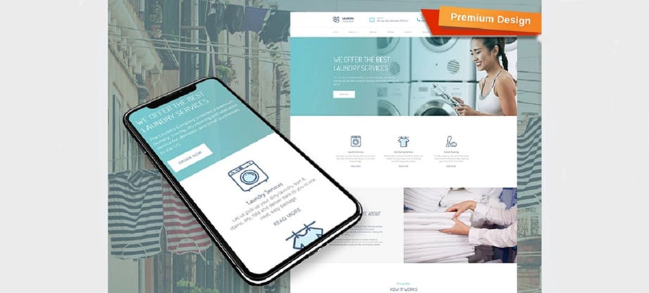
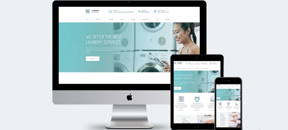
First and foremost, a great template should not only look attractive but be easy to customize. Undoubtedly, you don’t want to spend the eternity filling your future website with the content and editing various details. A good example of the appealing look alongside with simplicity in use is Laundris website template from MotoCMS. The best thing is that you don’t need any tech skills to launch a highly functional laundry website with it.
Next, pay attention to the responsiveness of the template you’re going to choose. Since nowadays many people prefer smartphones and tablets to desktops responsiveness is the thing worth taking care of. Unless you provide online visitors with great user experience on any modern device, your website has no chance of success.
Finally, make sure that together with the template you’ll get professional customer support whenever you need it.
Select an Appropriate Color Scheme
A wisely chosen color scheme is definitely one of the most important things in your laundry website design. It’s a common knowledge that the colors you select form the basis of the first impression your visitors get. Moreover, according to color psychology, each hue has its own impact on our behavior.
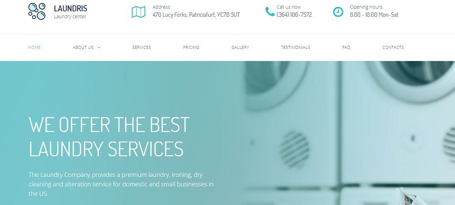
Nowadays the majority of laundry business owners give preference to white and blue in their laundry website design. It’s not surprising. While white is associated with cleanliness and hygiene, blue is an indicator of reliability and trust. In case you want to know more about colors and emotions in web design feel free to study our infographics.
Whether you decide to make use of color psychology or not, bear in mind that 3-4 colors are the limit. You don’t need more to create an attractive color scheme. Otherwise, your website may look tasteless and deter new online visitors.
Focus on Readability
Fonts are one more thing of vital importance in your laundry website design. Actually, the most valuable content is of no use if it’s hard to perceive. Consequently, choosing right fonts is one of your primary tasks.
To begin with, select a clear font that is easy to read. It’s a good idea to use an I/l/1 test to make sure that a font is really readable. Type a capital “I”, a lowercase “l”, and the numeral “1”. In case even two of them look alike it’s better to go for another font with more distinctive characters.
What’s more, don’t use more than two fonts. As a rule, they are quite enough: one for body text and one for titles, headings, and other design elements.
Take Care of the Right Content and Space Proportion
Never clutter your website with loads of useless information. Keeping your message short and to the point will help your visitors quickly grab the idea and memorize it easier. On the whole, the entire content should illuminate the most important things such as:
- the full list of services you offer;
- business hours;
- contact info;
- pricing.
Besides, always keep in mind that empty space isn’t less important than the content. Perhaps, spacing is the best way of giving balance, proportion, and contrast to each web page thus helping make things clearer.
Use Engaging Visuals
Today even a kid knows that visual content is a must-have component of any website. Generally, our brain processes visuals 60,000 faster than text. So, integrating images and video boosts the amount of information your visitors are able to absorb and remember.
Include photos or video of your services, team or happy customers to set a personalized tone for your website. A great idea is to display “before and after” photos. They will definitely tell more about your professionalism than hundreds of words.
Whatever kind of visuals you choose for your laundry website design, they should be of high quality. However, remember that high quality doesn’t mean a large size. Large size visuals will overload your website and negatively impact the loading speed. That’s why never forget to optimize the size of your files before implementing them on your website.
Make Your Business Easily Found
It’s quite obvious that your business is aimed at the local clients. Therefore, it’s a wise thing to help them find your company in the real life.
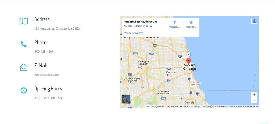
Take an advantage of Google Maps to show the fastest and the easiest route. Firstly, you will save much time for your visitors. Secondly, you can give them the first impression of your business via Google Street View. Thirdly, use of Google Maps will provide your laundry website with higher rankings in the web search.
Hope, now you see that it’s quite possible for anyone to create an effective laundry website design. So, the successful future of your business is in your own hands. Don’t waste time and start building your website at once. Take your laundry business online and meet hundreds of new clients at your doorstep in a little while.


