

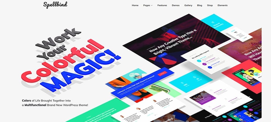
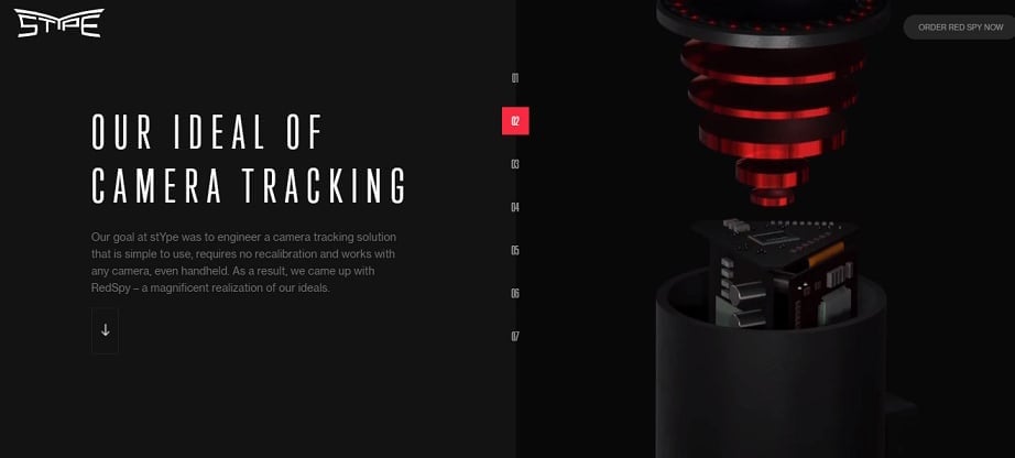
Implementing Scrolling Navigation Bar to Your Website

With the introduction of touchscreens, scroll became one of the most widely-used website design features. Thus, it affected many traditional web design elements that seemed to be rock-solid. The overall idea of a website with a sidebar on the right, logo in the upper-left corner and navigation menu on top of the page seems to be forgotten. There came more catchy and unusual tricks that attract user’s attention and ease we website use.
Scrolling navigation bar has appeared as one of such innovations that came into use with the growing popularity of touchscreens, mobile devices and Google’s focus to responsive design. In general. Navigation bar is one of those essential elements any website can’t function without. And one of the most complex too.
Navigation pays a lot to the user experience since it affects the way a user interacts with the website. The easier it is to use and the more seamless path it offers for website visitors the better the UX will be. And a good user experience seems to be something the Google may treat as a ranking factor.
Most Common Types of Scrolling Navigation Bar
Scroll navigation bar has many variants and most commonly appears in a form of a vertical navigation menu. But with a closer look, we may spot many other uses and types of this kind of navigation.
Single-Page Website Navigation
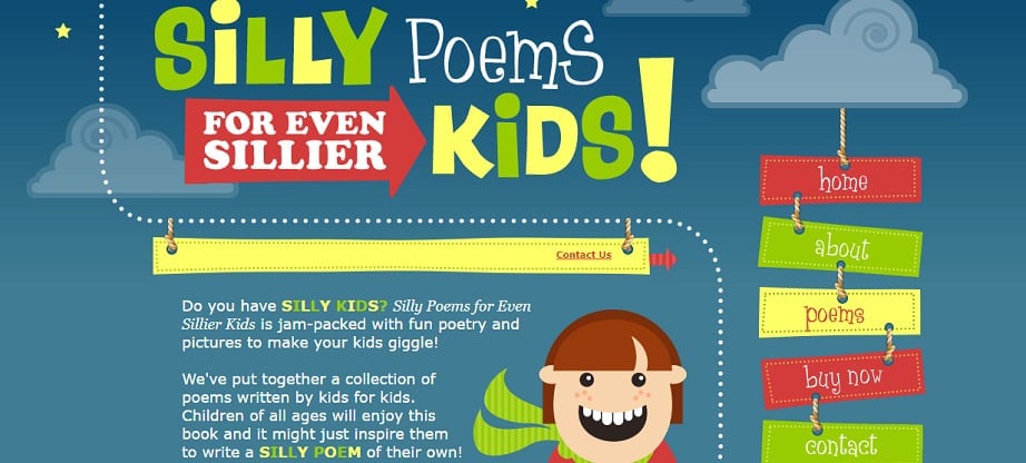
Despite one-page websites usually have a pretty simple structure and don’t require complex navigation, scrolling or vertical menus help getting a user to the top o down to a desired section fast and with a one click.
Hamburger or Hidden Toggle Menus
There were tons of discussions about the use of Hamburger menus. They are usually tiny and inconspicuous elements. You can even lose them among other design elements. On the other hand, it saves a lot of space. Since mobile devices have less screen space, Hamburger menus allow decluttering the mobile page layout. First introduced to iPhones, Hamburger menu is now a popular elements widely used across WordPress themes.
Sliding Drawer Navigation Bars
This type of navigation menu can be treated as a part of a Hamburger menu. Often sliding drawer navigation is hidden under the Hamburger icon and slides out of the right or left side of the screen.

Single-Column Navigation Bars
One of the best things about scrolling or vertical navigation menus is that they save space and at the same time allow showing much more info when summoned. This type of vertical menu is similar to mega menus. They usually have one column of categories and hide subcategories that show up on the screen when toggled or hovered.

Table of Contents
This is rather a specific type of navigation not any site would use. It mostly fits blog articles or Wiki-based websites. Some single-page layouts may also benefit of this type. The Table of Contents takes user to a specific section of the article with a click.
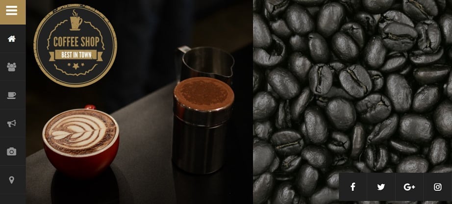
Stick-to-Top Navigation Bars
This can be almost any of the above-mentioned types that usually stays atop of the website when a user scrolls down the page. It leaves the user sure that they can easily jump to any page of the website or return to the previous point and never get lost on a website.
Issues and Solutions for Vertical Navigation Bars
Some designers claim that vertical navigation is not the best way of fitting the scrolling navigation bar into the website. But we all know that each issue can be solved with some work and cool ideas.
1. Vertical navigation categories take too much space
Yes, sometimes it may look like a bulky sidebar with categories and subcategories. While horizontal and sticky bars are usually more flawless and compact. Additionally, vertical navigation bars are wide enough to fit longer category titles.
Solution: Try using icons instead of category titles. Or find some shorter synonyms to replace those long words. You can also use traditional and user-familiar category titles like About, Home, Contacts, Blog etc.
2. Navigation bar crowds the layout
Complex websites usually have complex navigation structure. They have to display all those categories, subcategories, sub-subcategories etc. Such a foldaway menu can crowd the layout and impact the user experience.
Solution: When it comes to a complex navigation, users are more convenient with horizontal drop-down menus. There is one trick that helps to avoid issues with vertical mega-menus. When clicked, they can be converted into horizontal ones and stick to the top while users are browsing the website.
Another nice idea here is creating sliding drawer menus that appear on the screen when hovered or clicked. Hamburger menus can also serve the same purposes: saving the screen space and revealing the navigation info only when a user needs it.
3. Hamburger navigation icon
Hamburger icon is with us for relatively long time. However, it is still debated whether it’s use good or bad for the UX. Most arguments against its use are based on the fact that it can be easily lost on larger screens.
Solution: Hamburger menu is a good UX for mobile devices, since it saves a ton of space and is easy to tap and reveal the menu. Desktop versions can use either Hamburger icon or a word Menu that reveal the navigation when the user needs.
4. Navigation menu is inconspicuous
When users scroll down the page, navigation bar, whether it’s vertical or horizontal, usually goes up with header and all other “above the fold” info. So users may feel lost or frustrated having to scroll up to get to the navigation bar.
Solution: Go for a “sticky” menu bar that stays in front of the user’s eyes no matter how long the page scroll is. This simple solution is one of the most useful and popular today. If you use a ready-made theme, pretty all of them will include a “sticky” menu functionality to ensure the best user experience.
5. It takes conversion-friendly space on a page
Most vertical scrolling menu bars are placed on the left side of the layout. But according to the NN/group’s survey, the left side of the screen usually take up to 69% of the viewing time on a page. Thus, it is the best place for CTAs and various conversion-focused elements.
Solution: It’s simple! Just put the vertical scrolling navigation bar on the right side of the layout or use a sliding-drawer menu type. If you use a hamburger icon to hide your menu under it, you can even place your menu in the center of the screen. Due to unusual placement, it will attract attention and your users will never feel lost on your website.
The bottom line
Whether you use a traditional or some kind of vertical or scrolling navigation bar, you should always make sure it is user-friendly. Also, it must be aimed at helping users easily find what they need on your website. It can also be conversion focused and lead the visitors to purchases with some subtle hints.
And don’t forget to make a navigation bar one of the central design elements that stays well-balanced and harmonizes with the overall WordPress Website Design style.