The Art of Print Ads: 50 Catchy Designs
In today’s marketing world print ads remains a very effective means to grab the audience. A printed ad has got a specific format which designers have to take into account when creating it. The main idea or message should be communicated simply, be eye-catchy enough to attract the viewer’s attention and presented in the best possible way. But the question is how a designer can achieve a success and create an ad that would make the audience draw enough attention at the offered products or services. The question still remains open:)
Sometimes it is difficult to explain why one ad impresses on us, and another one doesn’t evoke any feelings. Print advertisement is a special art, and not everyone feels equal to the task. A perfect ad plays on our dreams creating an unreal vision of the world we can only be aspire to be a part of. It can also bring us back down to earth with a bump and a giggle. A good print ad speaks with you making you want the targeted product or service.
In this post we featured 50 interesting and worth-looking print ads to blow your mind. Some of them have been appreciated by prestigious award-winning projects and contests. Enjoy:)
[th_ft count=”4″ title=”Pick a Design for Your New Portfolio!” cat=”40″ type=”36″ keyword=””]
Clever Print Ads
An advertisement has only one chance to grab the viewer’s attention. Since there is no direct contact with the target audience, designing print ads is a more demanding task than some may think. To make a strong first impression on the audience, the designers think out carefully every single detail of the ad. This category presents some really catchy and clever print ads designs. Each of these ads is able to speak with you via a simple picture in a smart way.
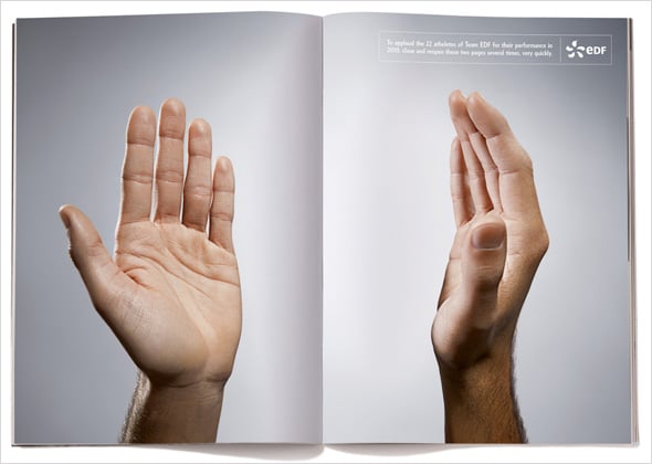
EDF: Clap Clap
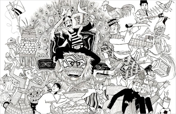
Get Lost in Indonesia: Tribes
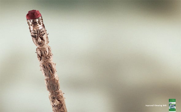
Mint Z: Totem
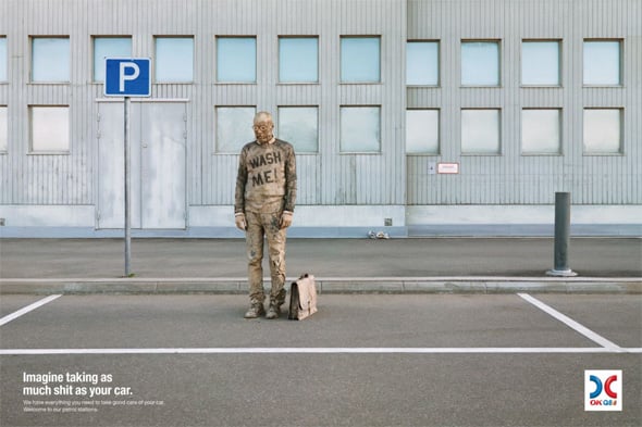
OK Q8: Wash Me
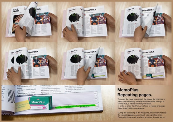
MemoPlus: Repeating Pages
Samsung HMX Q10: Left Handed Camera
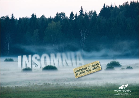
Mammadaba: Insomnia
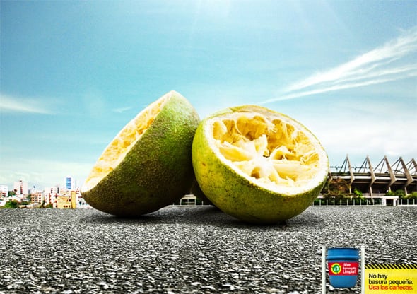
Vive Barranquilla Limpia: Lemons
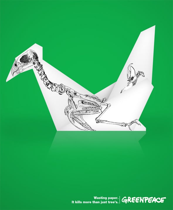
Greenpeace: Origami
Verde Florals: Office
Minimalist Print Ads
It is true than simple things often require of us much more efforts than some most complicated stuff. The main function of a minimalistic design is to be able to present a clear message to the visitors. To achieve that, the designers think over the content carefully to simplify the design and make it to be perceived as deeper and more intense. Here are some of the most interesting example of print ads created in clean style.
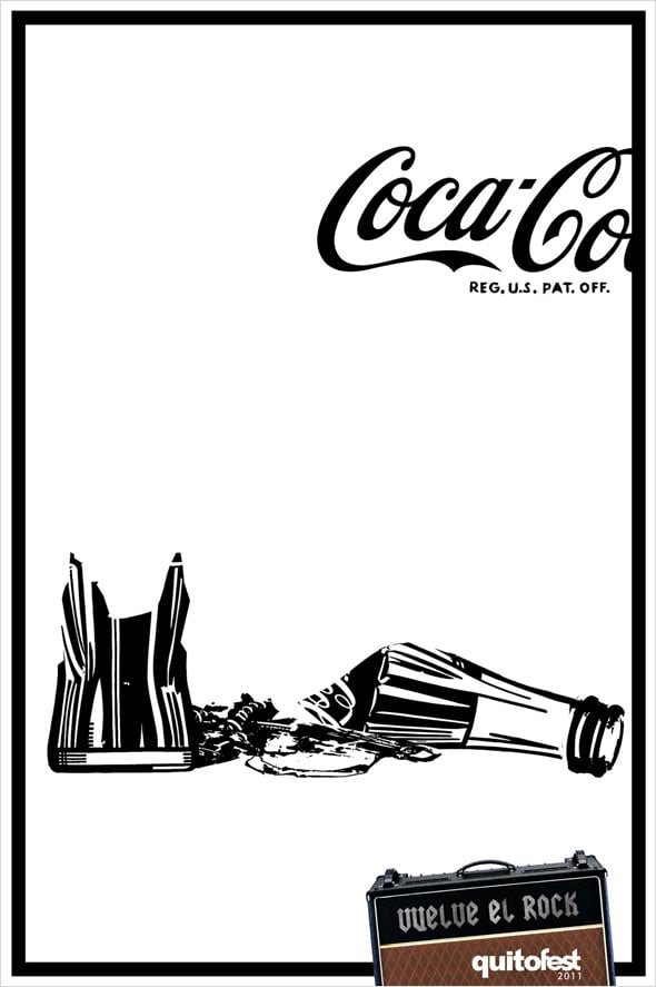
Rock is Back: QuitoFest 2011
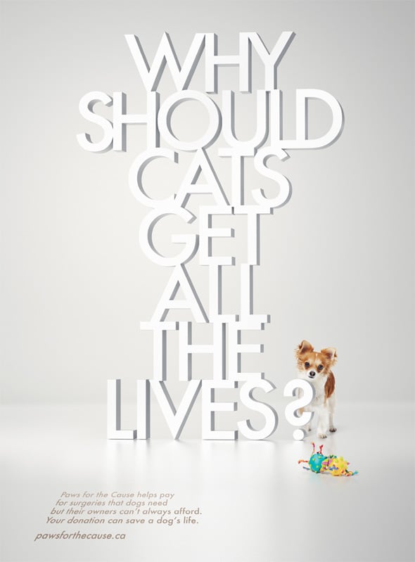
Your Donation Can Save a Dog is Life
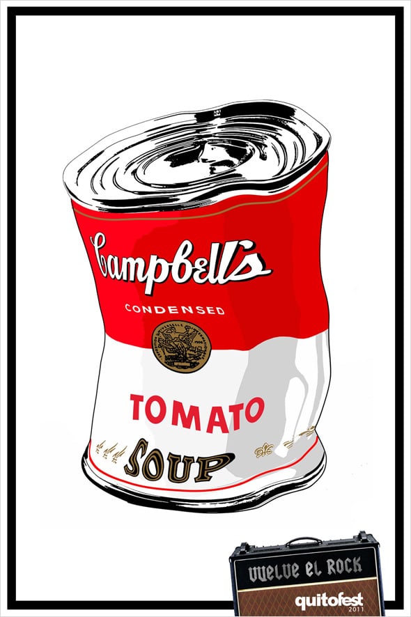
Quitofest: Campbell’s
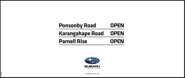
Subaru: Auckland Snow
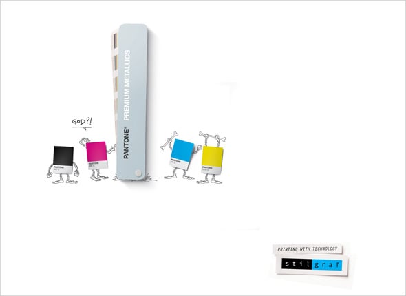
Stilgraf: God
Sensodyne: Feathers
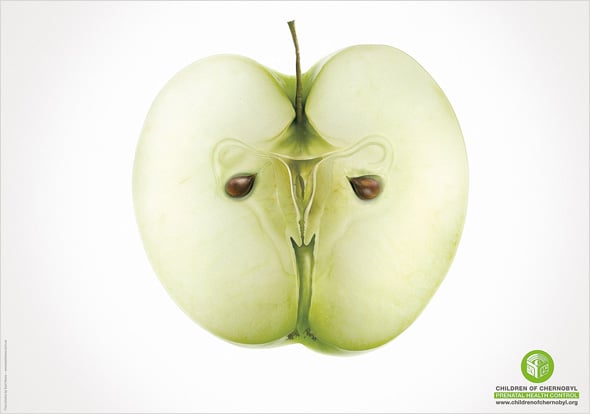
Children of Chernobyl: Apple
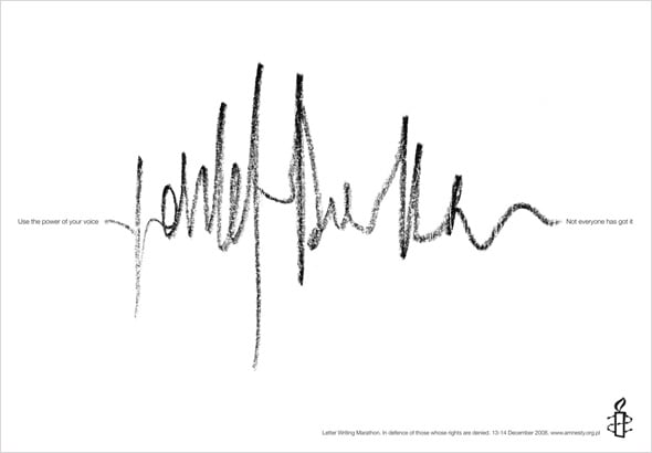
Amnesty International: Brown’s Voice
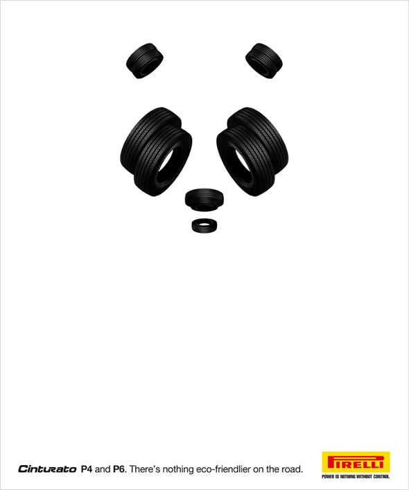
Pirelli: Panda
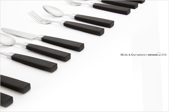
Restaurant Mirador del Alto: Piano
Award-Winning Print Ads
Looking at the print ad designs below, it is easy to see why the judges appreciated them highly. These advertisers are selling the power of imagination. It’s like a kind of a radio spot making you visualize what you don’t actually see. That is the most clear bright image of all.
We would like to show you some of the best print ads that were awarded recently by the most prestigious advertising projects and contests. Please take a look at them…
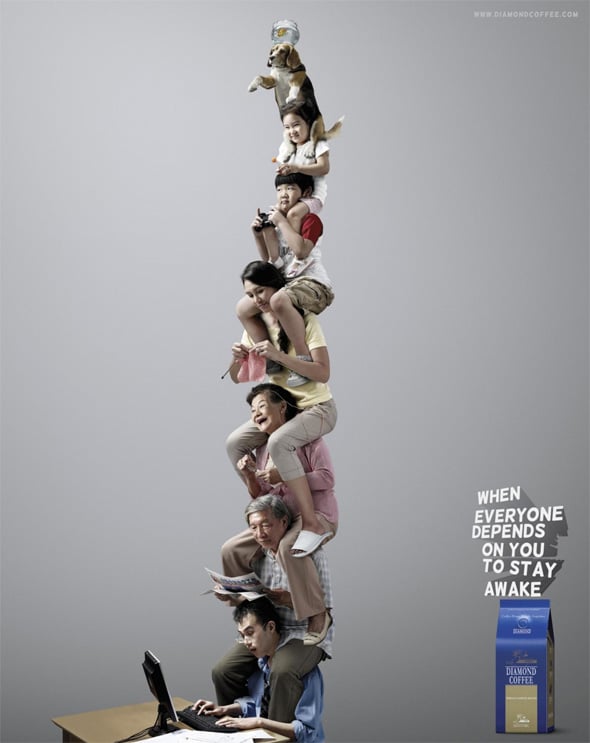
Diamond Coffee: Office Worker
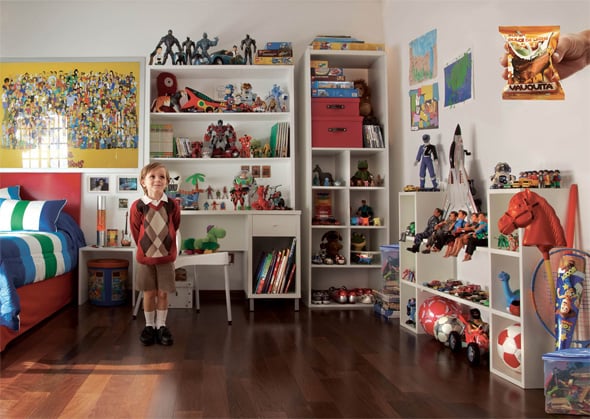
Vauquita: Order
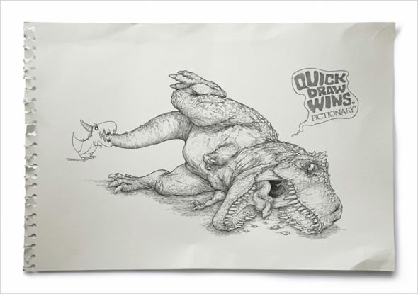
Pictionary: T-Rex
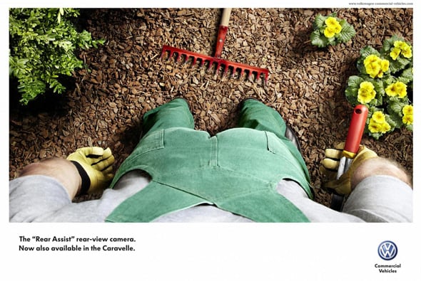
Volkswagen: Rake
Morphy Richards Epilators: Girl in a Saree
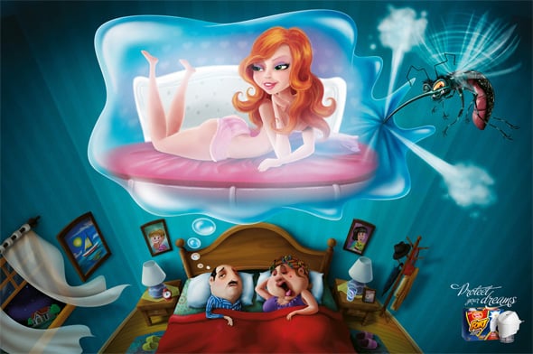
Bombfril Fort: Girl
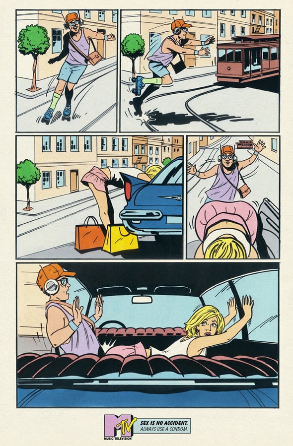
MTV Networks Schweiz AG: Sexidents, Backseat
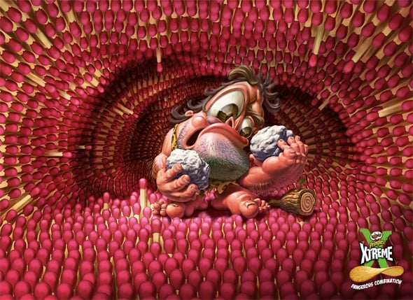
Pringles Xtreme: Caveman
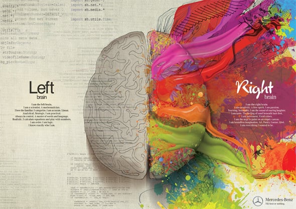
Mercedes Benz: Left Brain — Right Brain, Paint
Avis: Reunion
Funny Print Ads
Humorous advertisement has always been and remains one of the few most effective ways to grab the audience. In our supersaturated ads market it is a small window to catch the viewer’s interest. Funny images make us think twice and go into the idea. We hope you will enjoy these hilarious and funny ads. Have fun:)
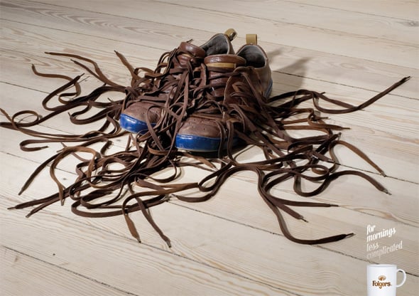
Folgers: Shoes
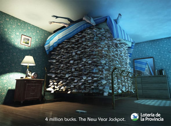
Loteria de la Provincia de Buenos Aires: Money
Electro Resycling: Robot
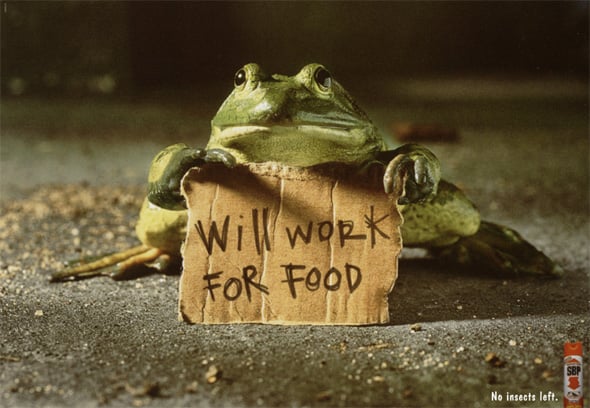
Work for Food
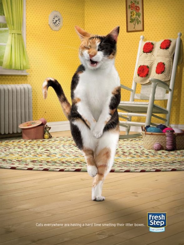
Fresh Step: Cross-Legged Cats
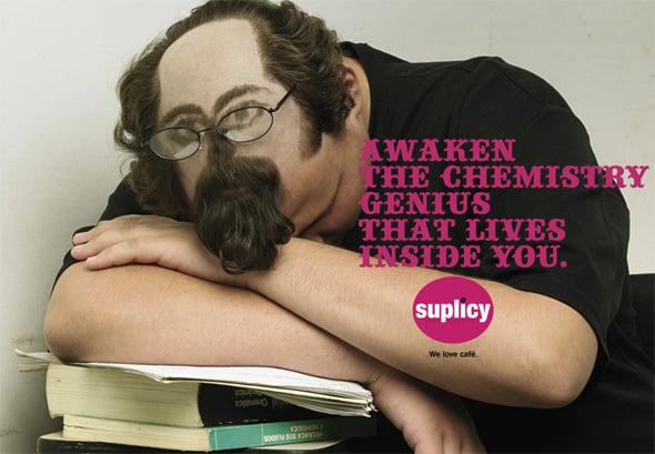
Chemistry Genius
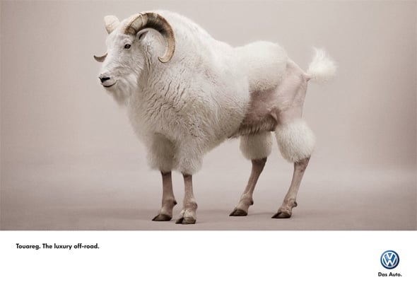
Volkswagen Touareg: Goat
Queer-travel.de: The other side of America
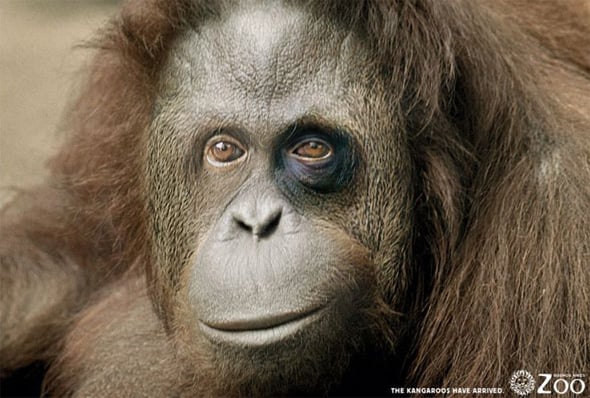
Buenos Aires Zoo: Ape
Utopolis, Group of cinemas: Titanic
Print Ads with Catchy Typography
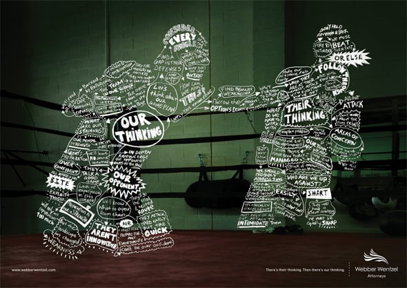
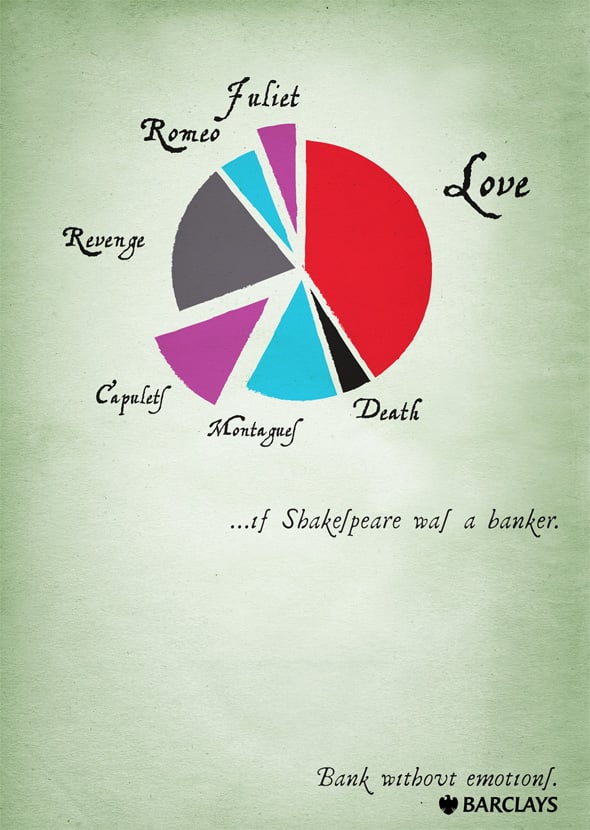
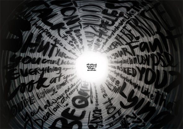
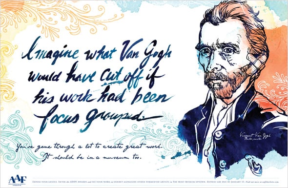
Using creative typography that would make people read is one of the core aspects in the print ads design. When choosing the type of the typography for the project, a good designer thinks about the message he wants to deliver to the audience, the type of the audience and the tone he wants to express. Browsing through the examples below you will see how important typography can be for print ads design.
Webber Wentzel Attorneys: Boxer
Barclays: Shakespeare
Christchurch Women’s Refuge: Tunnels, 2
AAF ADDY Awards: Van Gogh
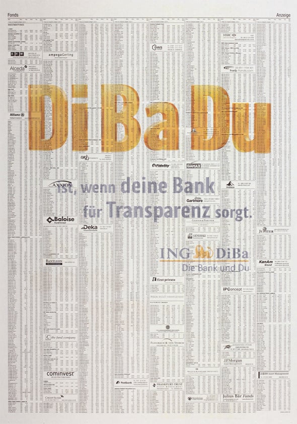
ING-DiBa: Shadowprint
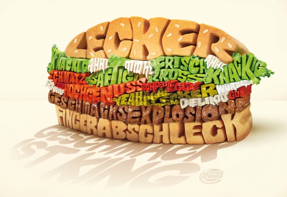
Typography Burger
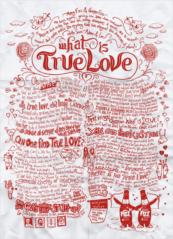
Appy Fizz, Grappo Fizz: True Love
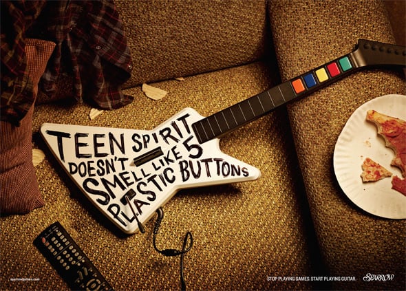
Sparrow Guitars
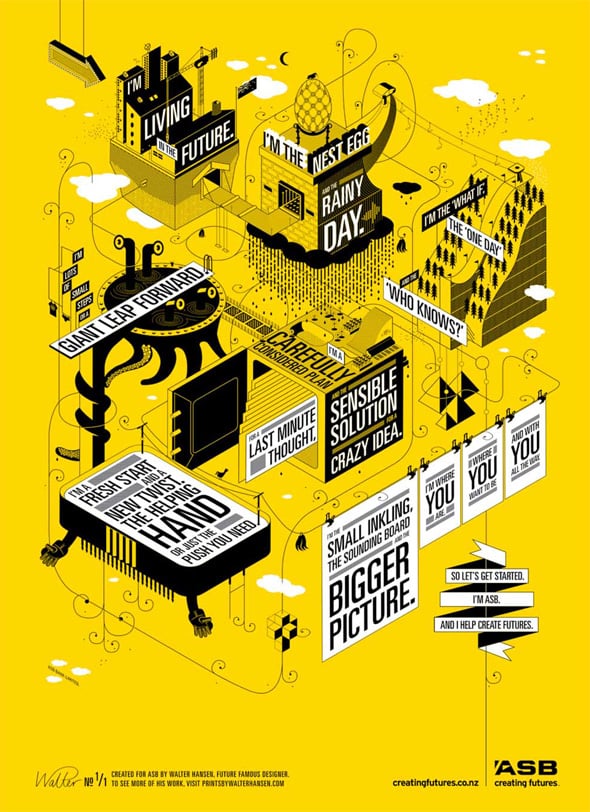
Droga5 NZ’s Creating Futures Campaign Component for ASB Bank
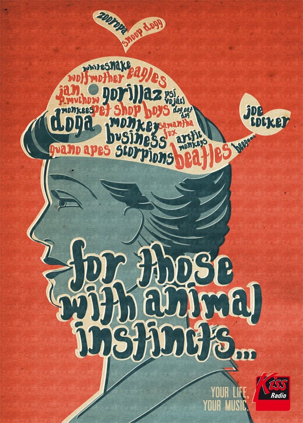
Kiss Radio: For those with Animal Instincts
We hope you liked the post:) If you have favorite print ads, please take a minute to share them with us in comments.
Sources:


