

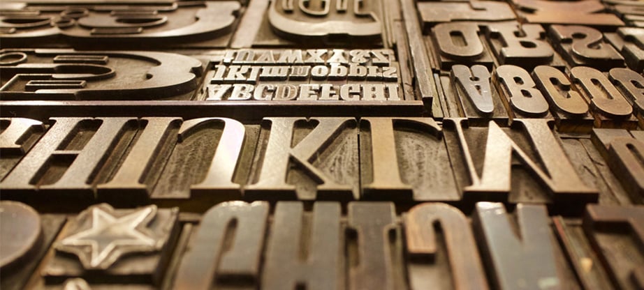
Typography in Web Design – 7 Amazing Examples for Your Inspiration

About ten years ago Oliver Reichenstein stated in his article about typography in web design that “Web is 95% typography.” Times are changing fast and today we see that Web becomes more and more visuals-obsessed. But we can be sure that a great volume of info on the Internet is still provided in a form of written language.
Typography in web design still plays vital part and helps get across important message or essential info faster and clearer. Text allows establishing connection between a brand and a user and thus, helps accomplishing conversion goals easier. Good typography makes text and information it carries more readable, accessible and user-friendly, to say nothing of the overall website design balance and improvement.
Here we give you a collection of the best and the coolest web typography examples that can teach anyone of a good use of fonts and their characteristics in website design.
1. Use Web Fonts
All modern browsers today support the use of web fonts. That means anyone can add to their CSS code for any web design font available at the hosting font website like Google Fonts via @import command or standard link tag. It eases the process of website designing since standard web fonts will be compatible with almost all screen sizes, device models and browsers. Thus, your text will be legible across all platforms and devices.
Another benefit of web fonts is the fact they are free to use. You don’t have to pay for the typeface you use on your website. And you don’t have to spend time to integrate them into your code. As we already mentioned above: they can be added to the website in a couple of minutes and with a few lines of code. Our friends from MotoCMS website builder integrate Google Fonts into the admin panel of their web design templates to help any user benefit from them while creating their own websites.

2. Limit the number of fonts
Too many fonts (more than 3 usually) on one page makes the website design look cluttered and unprofessional. The same thing concerns the combinations of various sizes and font styles.

The number of fonts across the page can be lowered to two or one without sacrificing the readability and UX of the design. It’s also wise to keep the same combination of fonts and their styles across the entire website design.
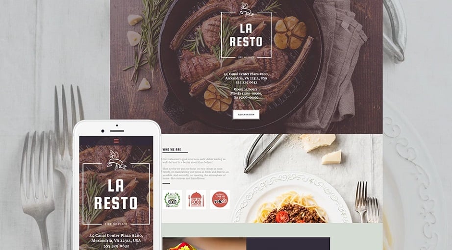
3. Combine your fonts wisely
The art of combining different fonts requires some efforts and design thinking. Not any website owner can find proper combinations without external help. Luckily, there are many services that offer ready fonts combinations that work, like Fontpair.co to find out the best combinations of serif/sans-serif or serif/serif fonts etc. Or you can use ready-made templates that already have professionally selected fonts.

One of the easiest and fastest ways of combining two fonts for a website and stay on the safe side, is choosing serif and sans-serif combination. You can also mix up straight and italic styles for one and the same font to add zest to your design.
4. Opt for easy-to-read fonts
Avoid typefaces that contain easy-to-confuse letters. Thus, some fonts may have letters ‘i’ and ‘l’ that look absolutely similar, especially written in caps or with the use of a certain size. So it’s better choosing fonts that have easy-distinguishable letters. Check out how the letters look in different sizes to make sure they will be easily perceived by your readers and are legible on different screen sizes.

You may also check the line heigh and make sure the spacing between the letters as well as between the text lines is enough to tell one letter from another. Moreover, proper line height between the lines adds more white space and makes the text more readable and cleaner.
5. Be careful with All-Caps text
Caps (capitalized letters) can be a great way of using typography for design purposes. The text written in all-caps draws attention and serves as a decorative element. But it’s better to avoid using all-caps for the body text or all-around the page. All-caps text impacts readability in a bad manner and even lowers the speed of reading. It impacts the user experience what can affect your website trust rank negatively.
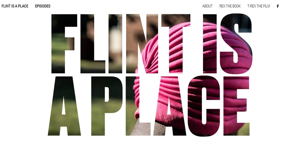
Use caps only when it’s justified – for logos, headers, brand message on a Home page etc. Embed it as a decorative element when it really coincides with the website design.
6. Choose proper color combinations
Color combinations is one of the most discussed and controversial topics of typography in web design. Designers should take care of proper color combinations across the entire website, and typography is not an exception. One of the main focus points here: the font color should not merge with the background. They should be distinct to ease the readability of the text, but don;t have to be too contrasted to not cause pain to visitors’ eyes.
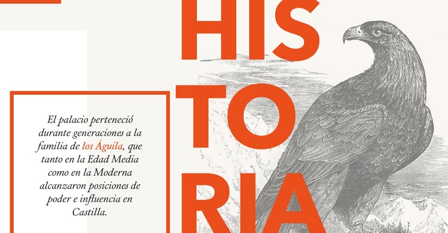
Take care of accessibility to allow color-blind users read your message with ease. Thus, it’s better to avoid red and green colors for typography in web design. Red and green are the main types of color blindness, so if you wish to convey your message to the most of users, choose other colors for your text.
7. Make your typography responsive
Modern users are more and more used to access websites from their mobile devices. No wonder, that responsibility is one of the main requirements for the websites today. Typography in web design is not an exception and thus, you should carefully examine how your text and fonts look on different screen sizes.
Experiment with your typefaces. Choose ones that show the best results of legibility on different screen sizes – from the tiniest to the largest. Avoid cursives for body text since it will not be legible on smartphone screens. You can read more cool tips about responsive typography in this article.
Typography in Web Design Conclusion
Typography plays essential part in web design despite the popularity of visual solutions. And it will stay the best way of conveying important messages for many years. So you should pay careful attention to your fonts choice and their use in the website layout and design.
Make your text readable, easy-digestible and accessible to all users. It will add to your website UX greatly and may even affect your rankings in search engines.