

10 UX Design Patterns for Better Onboarding UX

The main goal of creating a website or application for your business is to make sure it gets a larger target audience. In order to make this possible, you have to create a usable application or site. So, if you want to figure out an app or website redesign cost to create a truly great onboarding UX, it’s great to discuss the right strategy for your business with the experts.
Additionally, a terrible onboarding UX can have disastrous consequences, which include a steep drop after user sign-up, non renewals, and can lower the number of paid conversions. Your onboarding should always be about your customers. This will allow you to create a product that is centered on user experience.
User Onboarding Best Practices
When you create a product that grabs the attention of customers, you must make sure you deliver what you promise to them by avoiding mistakes in your onboarding design. Here are some of the best user onboarding practices:
1. Account Registration UX Patterns
Account registration helps you to identify who your core customers are. Popular mistakes in account registration design patterns include the following:
- The sign-up button is not visually evident to a user;
- Your custom call-to-action buttons are not evident or not placed properly;
- Relying on one point of action (use various locations to elicit an action).
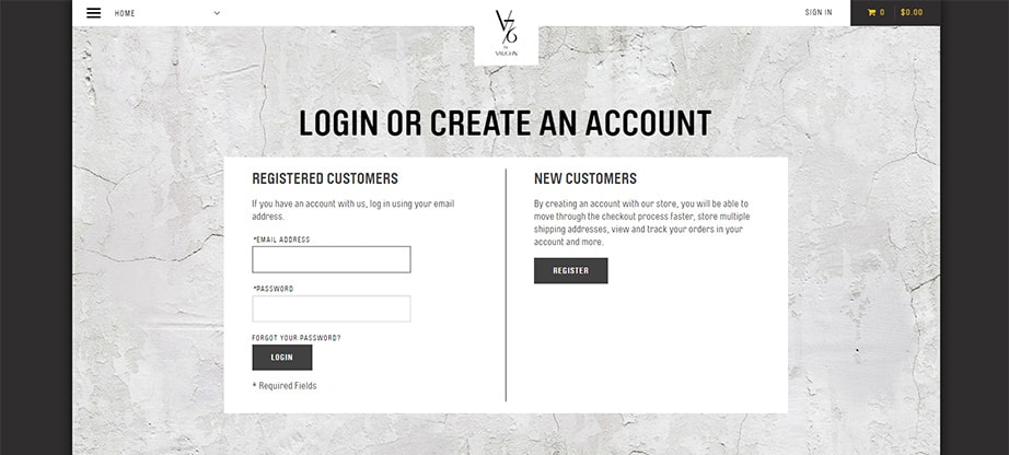
Moreover, account registration has become very popular on many websites, and there are many great examples like v76 .
2. Lazy Registration UX Design Patterns
Lazy registration is a feature that all website designers should add to a landing page. The additional functions include:
- Enabling users to try out and compare your website to your competitors;
- A reassurance to the user that you are not forcing them to register an account;
- Enabling users to have time to make up their mind, especially, if registration requires money.
Wordtracker is an example of lazy registration put into use. It provides users with a limit to the number of searches they can make before asking them to sign up.
![]()
3. Blank Slate
Another important piece of UI is having a blank slate design. The role of this feature is to help a user figure out how to use an application/site. Other important roles include:
- Motivating a user to use the service
- Making sure a user has a good experience when interacting with your system
- Helping the user to learn the best features of the website/application
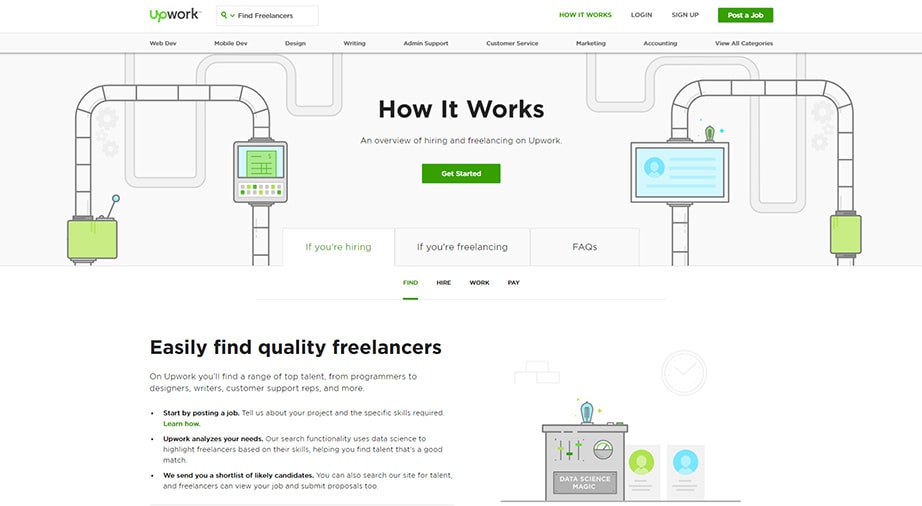
A lot of web applications can serve as onboarding design examples using this UX design pattern. Upwork uses this design template to guide users to create jobs for freelancers.
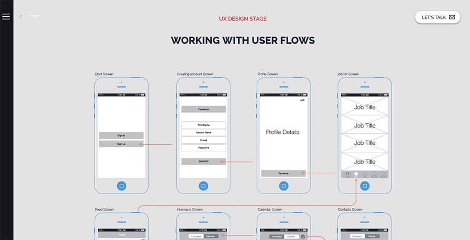
4. Guided Tour For Better Onboarding UX
As the terms imply, a guided tour design pattern is created to help users figure out what your web application is all about before proceeding to work with it extensively. It is also used in the following instances:
- When users are unfamiliar with your product;
- When your user interface is not self-explanatory;
- When you introduce brand new features to your application.
This is a very helpful onboarding UX pattern to add to your design. It also acts as a guide to make sure that your users don’t feel unfamiliar when they use your product, even after a long period of time. Agentestudio uses this feature extensively.
Furthermore, with guided tours, you can boost brand awareness, improve user experience, and generate product usage data. First-time users observe and experience superior usability, relevance, and support with less effort, especially those who aren’t that tech-savvy or with impairments.
When users are properly guided, the likelihood of performing in-product actions is high. Hence, analytics tools can gather accurate product usage data to help marketers make smarter product decisions without guessing what users want. You can iterate your UX design based on the product usage data to improve guided tour elements in future updates.
While guided tours provide a seamless experience for users, product teams can use the generated data to monitor the app usage’s quantitative data points, including user session length, devices, locations, and the features users use. As a result, you can align your UX design with user needs to provide a seamless experience, improving your click-through, traffic, and conversion rates.
5. Inline Hints
Inline hints are also used to provide direction to users to enable them to better understand how your product works without obstructing them from any other features. They do the following:
- Preserve readability of directions;
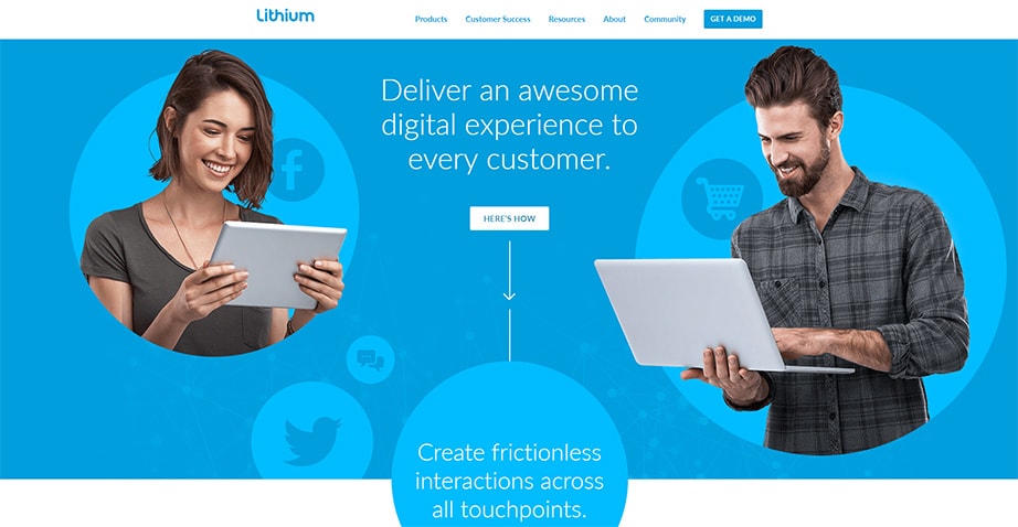
- Give crucial information, together with blank states (used by Lithium );
- Keep the content experience of a website or application uninterrupted.
Inline hints, even though they are great for onboarding UX, should never be used to provide important instructions.
6. Forgiving Format Design
Users tend to abandon the user interface if they’re forced to correct all slip-ups or mistakes. Hence, a forgiving format is a practical UX design that allows users to commit mistakes without requiring corrective measures so they can perform tasks seamlessly. This design corrects mistakes on users’ behalf. It’s a fluid design without the frustrating stiff key-and-keyhole approach.
Normally, the search function offers several options when you are looking for something, which can sometimes be complex. A forgiving format helps in the following ways:
- Reduces clutter to your system’s interface;
- Enables users to enter information in any format.
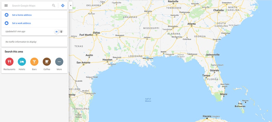
Google maps enable the user to enter several forms of data (city name, latitude, and longitude, etc.) to get a result.
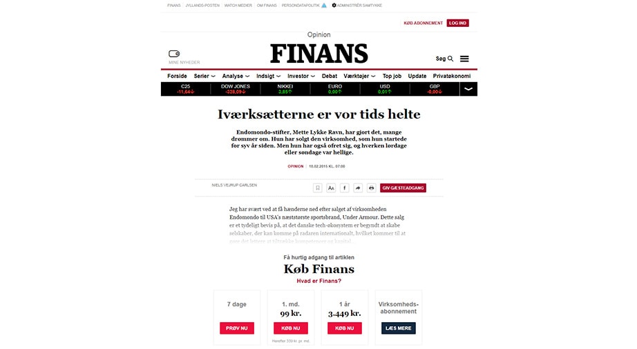
7. Onboarding UX Coach Marks
Some websites have a very complex UI, and interacting with them can be very frustrating; however, this doesn’t have to be the case. This is where coach marks come in, as they are used to enable individuals to be quickly accustomed to a complex user interface.
Coach marks are on a transparent overlay, which enables users to follow every step without losing focus on the main content. Finans puts this design feature to good use on its website.
8. Paywall UX Design Patterns
Some websites require the user to make a payment in order for them to be able to access restricted content. Having a well-designed paywall is very crucial for the success of such websites. Keep the following in mind before using this feature:
- You can use it when you want to directly make some money from the content added to your site;
- Using this feature on a website that makes most of its money through banner impression is not advisable, however.
Great paywall examples can be found on websites like Timesplus.
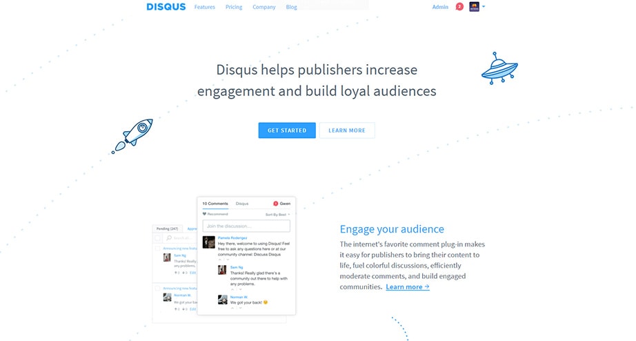
9. Tooltips For Onboarding UX
Tooltips are primarily used to help direct users to particular content on an app or website. Tooltips have been abused, however, and it takes a lot of skill to convince your users to trust them.
This can be accomplished by providing short tooltip guides. Make sure you live up to your promise to your customer so they accomplish the action. A good example of a tooltip used effectively is seen on Disqus which is found at the end of the onboarding flow.
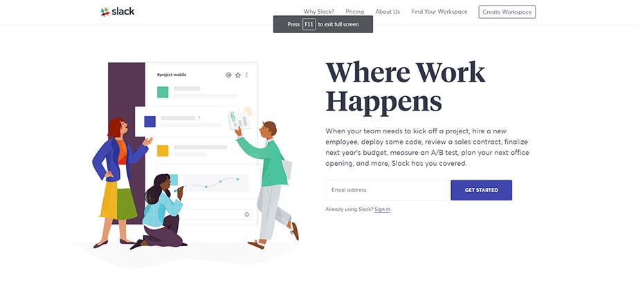
10. Welcome Pages
Welcome pages are widely used to collect the most important information, and as means to create excitement. One of the best features of this pattern involves its ability to do external data processing.
This is important because users do not have to see a loading screen every time the app/site is trying to process any of their actions. A good example which shows a welcome page when a product is loading in the background is Slack.
Conclusion
Once you review these expert ideas used by some successful corporate businesses, you will be inspired to make your move. Remember that your customer should remain the major focus during the entire design process. Good onboarding UX will help you produce a successful product!