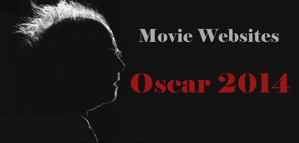
Do you remember that the Oscar Show is coming this weekend? A few days left to this big day and big event. Still and all, you have some time to learn a bit about this year nominees. In this showcase I gathered the official websites of the movies fighting for the Oscar.

Movie websites as a web design category is full of surprise, because it demonstrates users diverse features, trends and up-to-date design elements. As a rule, websites are launched much earlier that the film releases in order to demonstrate trailers, get devoted movie fanatics interested in a picture. Now I am really interested in whether the websites of popular movies are cool and professionally designed. I suppose that the best movies should be displayed on high-class themes. Let’s check it out!.
This year there are 9 movies to be in the nomination of The Best Picture. They are absolutely different, but each of these grandiose cinematography works is worth attention and victory, of course.
American Hustle
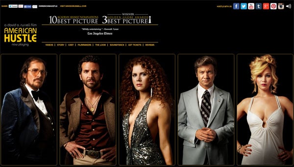
This black website with a regular top horizontal navigation menu bar is simple and easy-to-use. The home page features five blocks with the pictures of the main movie characters. One of the good features this site has is background music. It adds a special thrill to the overall design and brings the site to life. The only thing this website lacks is speed – the page downloading is too slow.

Captain Phillips
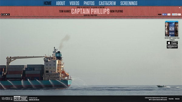
The start page of this website shows a block with three options and one of them is browsing a site. Each page of this theme opens with a short video from the movie. This feature raises the website rating and makes it more attractive. Quite a nice site I would say.

Dallas Buyers Club
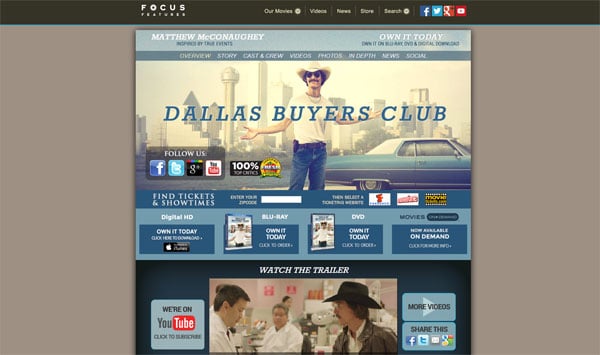
Dallas Buyers Club doesn’t even have own website. It is represented on one of the pages on the Focus Features website. I doubt whether it is a good idea for an award-winning film.

Gravity/h3>
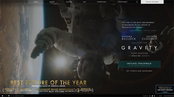
I thought a movie-masterpiece would be showcased on a superior website, but I am not sure whether this site is really super. There are many good tools incorporated into the theme, like video-based background, fully-functional photo and video galleries, but as for the background music – it doesn’t work. Still, music was supposed to fill this website with energy and certain feelings, as the music icon is embedded to the layout. The Gravity movie has high chances to get the Oscar, but its website would hardly ever win any award.

Her
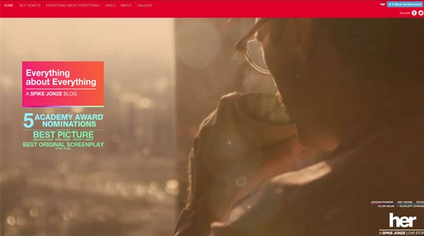
Video-based websites are going to be a trend in 2014, and that is why this site has a video background. I like this red navigation menu bar – it stands out on the canvas and is rather light-to-use, but slow loading of the pages kills me.
Nebraska
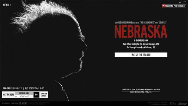
Nebraska film was shot in black and white, so of course the website’s color scheme is black-and-white yet with a few pints of red. This powerful website is really well-designed. Plus, it is user-friendly – the cozy and usable navigation menu plays a big role in it.
Philomena
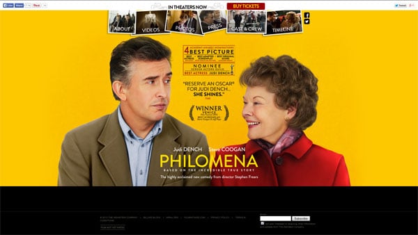
This website has a simple design with cool menu tabs looking like shots. Background images are a casual thing for modern websites. Ordinary, light and pleasing site with no innovative techniques or super cool details.
12 Years a Slave
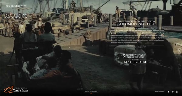
Endless scrolling websites are the most trendy ones in 2014. This website representing a great movie is navigated by down scrolling. The first page is a video-based one, rotating short videos from the film one by one. The other pages are image-based with compact scrollable text blocks. The theme is equipped with a grid based photo gallery. I find this website pretty good, modern, captivating and deserving attention.

The Wolf of Wall Street
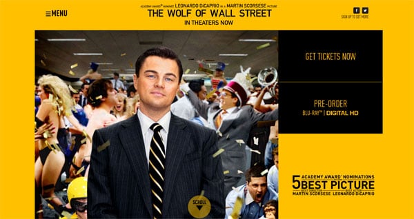
Here is another website with parallax scrolling, and it is even better than the ‘12 Years a Slave’. What I like about this site is a double navigation. If you want to read the website as a story, you may use scrolling, but if you are looking for a certain section of the theme – use a simple vertical menu bar. Friendly yellow color is a good choice for a site – like this!

I would stake on The Wolf of Wall Street in the 86th Academy Awards, if to judge by the websites only. I loved this site the most in this category – it is eye-popping, has a pleasing to eye color palette and looks amazing. Nevertheless, I haven’t seen all movies from the list and I have no right to decide which one is the best then. We’ll know the results very soon.
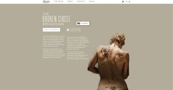
Another nomination is going to be Foreign Language Film. Here we have five nominees and only 2 of them have websites. The Hunt, The Missing Picture, and Omar are not presented on websites. Ok, let’s see what two others have prepared for us.
The Broken Circle Breakdown Official Site

The Broken Circle Breakdown US Website
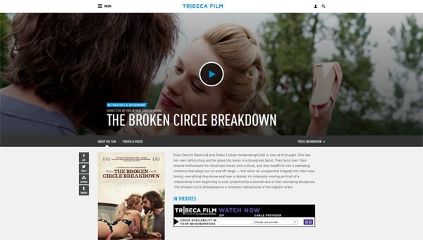
The Belgian drama ‘The Broken Circle Breakdown’ is portrayed on two websites. The first one is much simpler than the other one. The US website (the second) has a fullwidth Header image with an embedded film video on it. These both sites are quite casual, I would say, but they have a certain design concept. They are not bad, that’s for sure.

The Great Beauty
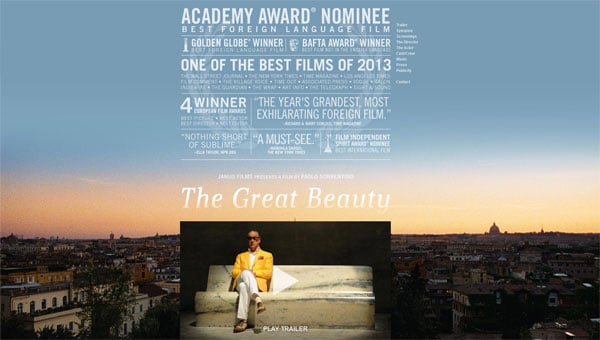
This is a one page website, which is both scrollable and operated via the navigation menu. A static background image gives no motion to the site, but keeps it nice enough.
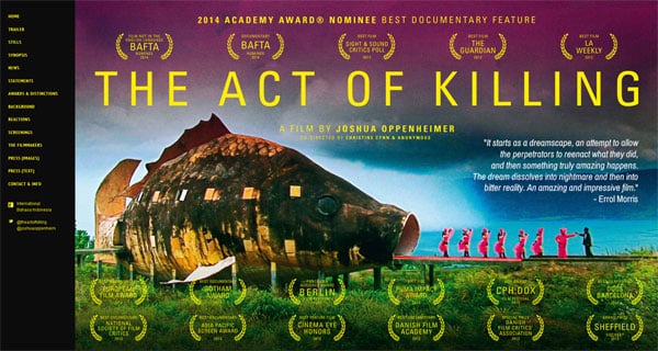
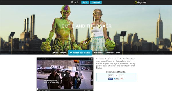
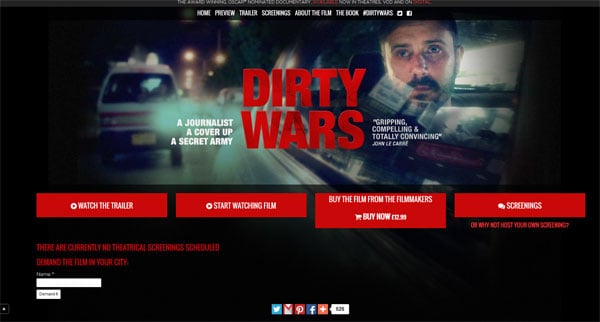
The Documentary Feature Nominees are showcased on simple and structured websites. These are static themes with images, galleries, light navigation schemes, but without creative and interactive designs. These sites raise serious issues, so they are not intended to entertain users. Look through these themes – they feature great documentary movies which deserve attention and watching.
The Act of Killing

Cutie and the Boxer
Dirty Wars

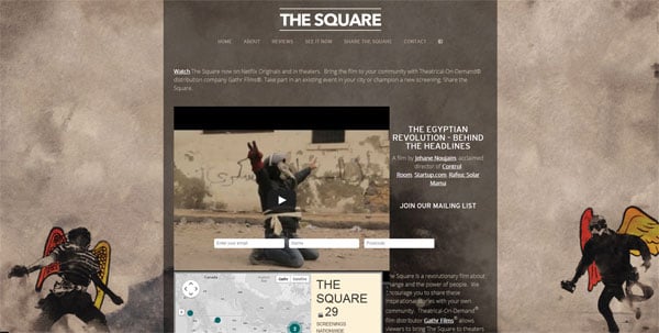
The Square

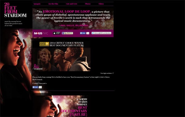
0 Feet from Stardom

Let’s move further and see what’s the next nomination is. It’s the Animated Feature Film.
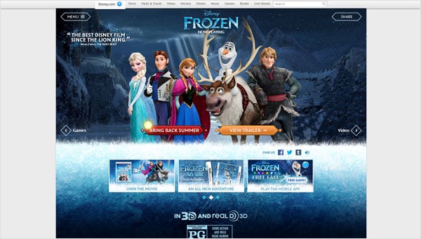
Animated films are colorful, beautiful, captivating and so exciting. They are watched by kids and adults, they bring us joy and make us smile. So, five cartoons are going to fight for the Oscar in this nomination. Three of them do have picturesque websites, while one is granted with just a separate page on the Disney Website (Frozen) and unfortunately, we have no opportunity to marvel at the Wind Rises website – there is no such. Enjoy these nice web design artworks!
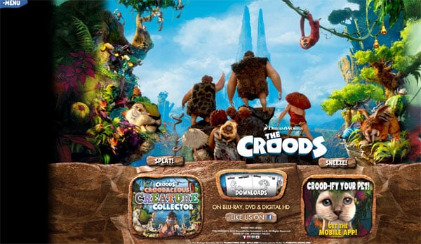
The Croods/h3>

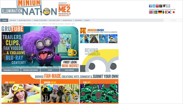
Despicable Me 2

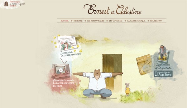
Ernest & Celestine

Frozen
How do you find these websites? Which one have you liked the most? I like the Ernest & Celestine – it is animated, interesting, funny, has a charming color scheme and music background. There is no doubt a great job was made to build this awesome theme.
Conclusion
Now let’s summarize all the best features used for the movie websites showcased in this post with one the most successful example to each:
- Video-based background (Gravity)
- Full-screen background images (Philomenia)
- Parallax scrolling (The Wolf of Wall Street)
- Light-to-use navigation (The Act of Killing)
- Black-and-white color scheme (Nebraska)
- Grid-based layout (Despicable Me 2)
- Animation (Ernest & Celestine)
- Impressive imagery and vivid colors (The Croods)
I believe some nice websites from this collection really caught you. I am curious to know which ones? Please, feel free to share your thoughts on this roundup in the comments section.