The Dos and Don’ts of Logo Design
The most important thing to establish when creating a business is your brand. This is the entirety of what customers and clients view the company as. The style, the atmosphere, and the first impression are all in the branding. And the most eye-catching aspect of a brand is the logo.
Designing a logo is very difficult, especially for the biased owner of the company, as there are so many possibilities to choose from, and a logo is so delicate and simple. Mostly it’s just one shape, form, or letter, but some logos are complex designs involving fonts, colors, and multiple shapes.
Two things need to be established before starting to create your logo. The first is a basic idea of your brand, and the second is the name.
If you don’t know what you are as a brand yet, here are a few questions that can help guide you to a conclusion.
- If your brand was a person, what kind of person would it be?
- If your desired customers were one person, what kind of person would that be?
- What three companies would you view as your competition?
- What are you elevating?
If you answered these questions, you have an elevator pitch. Putting this basic idea together with the name should give you an idea of what the logo should look like. Everything in designing a logo should be intentional and part of the story you are telling. It’s a form of speaking with colors and shapes.
Another important question people ask is whether they should hire a designer or not. A marketing specialist, even one on the ground floor, has a good understanding of the workings, importance, and “anatomy” of a logo, and while there are a lot of opportunities and apps that help create our own logo in the snap of a finger, hiring a professional can never be a mistake if you have the budget for it. To better comprehend hiring a freelancer, it’s essential to read some advice on remote onboarding before hiring a designer. This Lensa post may be helpful.
Logo Design Tips
While it’s best to keep a logo the same for multiple years, it’s important to remember that your decision now will not be something to carry forever, and a logo can continually be redesigned. Having said that, there is still pressure on the decision because everyone knows that a company that changes its logos in drastic ways or often comes off the wrong way to the audience. Looking at Starbucks, for instance, went through one drastic change but still kept the basic style and idea the same.
Building a logo is all about shapes and colors. Even letters and numbers are broken down into shapes, and sometimes even merged together with basic forms. So to design your own logo you must have an eye for the aesthetics of shapes and colors and creative tendencies.
Designing a logo uses the dense shapes and colors inside the logo, but also takes this a step further by working with the empty spaces in, and around the logo.
The number one thing to constantly do while designing the logo is imagining it, or actually placing it in situ while designing. This helps see what comes through for the audience and can give good guidelines for sizes and proportions. Embedded into the website, a logo should pop, but also frame the aesthetic of your business. Think of Netflix’s, or Apple’s logo. While subtle and simple in both the design and colors, every line is intentional, and even in muted colors, it pops on their website.
Overall, the look you’re looking for is authoritative and literal. It’s not an enigma, complex or confusing. It’s delicate, elegant, and authoritative in nature. For pointers, it’s good to look at leading fashion logos like Ralph Lauren, Versace, Burberry, or Yves Saint Lauren. All of these are authoritative, memorable, literal, and extremely elegant, and understated.
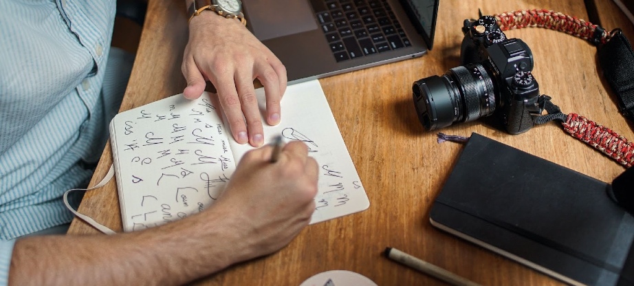
Photo by Ivan Shilov on Unsplash
Mistakes to Avoid
There are several mistakes to avoid when designing your logo, and here are a few more common ones. Firstly, the number one mistake people make the most often is looking at a logo as a predetermined font. Of course, a font is being used in the end, but as stated before, even numbers and letters are designed and treated as shapes and forms when it comes to a logo. So when “choosing a font”, make sure you choose wisely and try to take apart the font to represent shapes instead of a fully designed style. A great example is a difference between “grounded” and linear fonts. Grounded fonts have little feet on the button of letters, while line-style fonts don’t, and that makes a huge design difference with the added line.
Another big mistake is making the logo too abstract or too busy. This was also mentioned above that a logo should be literal and clean. It shouldn’t be a mystery to be solved and shouldn’t be too busy to take away attention from your brand. Also, a busy logo doesn’t look good when shrunken down to tiny sizes, and a logo must also be able to present in small sizes.
When starting a company, every step needs to be cautious, so a step-by-step guide template will be helpful. In this way, it’s also essential to look around the market and look out for direct or accidental copycats or plagiarism. It not only causes legal problems but could also be problematic for marketing and PR reasons.
Designing a logo, while seemingly the smallest part of establishing a business, is actually the most challenging and complex design aspect of a brand. It’s also the thing you don’t want to change weekly, so you have to be set on your intentions and main idea. Be cautious, consult with people, and if you feel overwhelmed, hire a designer to help you through the process or consult one to take bias out of the equation.


