With a growing trend to simplicity and lightness that emerged during last year, more and more plain design elements stand out and gain popularity. One of such elements, ghost button, can now be seen on a great number of websites you can come across when browsing the Internet. It seems to be very useful and variative, however, as any new introduction, ghost buttons trend rises controversy and gains opponents as fast as it’s gained its backers.
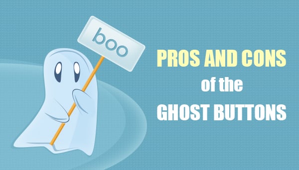

What Ghost Buttons Are?
Before we outline the main pros and cons about this kind of button, let’s learn what ghost button is. Ghost button also has titles like “empty”, “naked” or “hollow” button and is usually seen as a frame with transparent or semi-transparent background and a call-to-action text. Many designers use such buttons instead of traditional “Read More” or “Enter Site” buttons. Hollow buttons may be noticed mostly in minimalist-style designs, in popular today flat UI and metro-style designs, or one-page websites that require heavy scrolling.
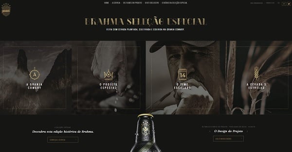
Brahma

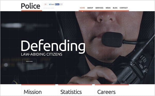
Police Website Template

Simple shapes provide this kind of buttons with elegance and clear perception. The most popular shape of the hollow button is a flat rectangular or oval box with no visual decorations or 3D elements. It may sound boring, but with properly chosen background and well-outlined contrasting border hollow button attracts attention without giving a visitor overwhelming impression. In combination with simple and classic fonts for the text inside, empty buttons create a sophisticated look.
Those empty buttons may appear alone on a home page or be combined in groups. The main idea – is to use a ghost button in prominent places of the page to make it noticeable for visitors. Some websites even add tiny icons next to the button to highlight its role and attract attention.
IUVO

The Good and the Bad About Hollow Button Use
Among main pros on hollow buttons use are:
- Fresh and modern look;
- Easy to create even for a novice designer;
- Versatility;
- Simple design that can be integrated into any layout.
Cons include the following reasons:
- They can really become unnoticeable “ghosts”;
- Not every button on website can be made in hollow style;
- Mostly ghost-style buttons look exactly the same on almost all sites.
Let’s look closer at those “goods” and “bads” about the use of hollow buttons.
Advantages of the Ghost Button
As for look and style, it’s obvious that ghost button design emerged from the latest trend on flat user interface. Empty buttons fit this trend the best. Simple and plain rectangular shape in combination with neat font inside the frame look perfectly within flat UI. Sometimes it’s the best way to add a cutting-edge look to the new website design.
Tokyo Mild Foundation

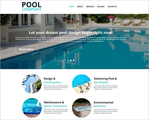
Biamar

Pool Company Website Template

Another advantage of empty buttons is their versatility and great integration into any style – from minimalist to grunge or retro. Sometimes vintage look of the website design can be created and highlighted exactly with the use of simple rectangular ghost button with white borders. A proper use of inside font adds style to the button and helps it fit into any design.
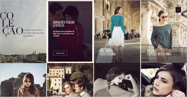
Benoit Challand

Elespacio

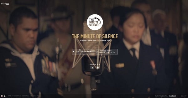
Minute of Silence

As far as hollow buttons are mostly used on large backgrounds, it’s essential to use contrasting colors for borders and inner text to make them more prominent. With a proper and harmonic choice of colors hollow button will be a perfect design element that draws attention and makes user perform a necessary action.
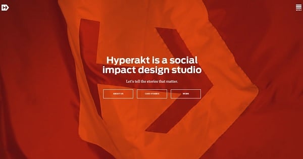
Hyperakt

Simplicity is a key reason that makes ghost-style buttons so popular. Even a beginner may create such a button. Empty buttons are based on classic geometric shapes like rectangle, oval, rhombus or even circle. Decorations are used rarely and may ruin clean style of this design element.
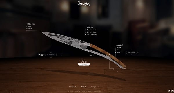
Deejo

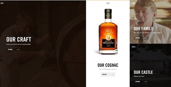
Braastad

Ghost Button Drawbacks
Due to clean and simple design of the hollow button it can sometimes become a real ghost. Some designers blame it for tendency to blend with the overall layout. There are fears that many users that aren’t used to the new element may not notice the ghost button or consider it’s not a clickable element. The best possible “out” in this case is to make ghost button much bigger than usual buttons, place it in the most prominent position on the website page (usually – in center).
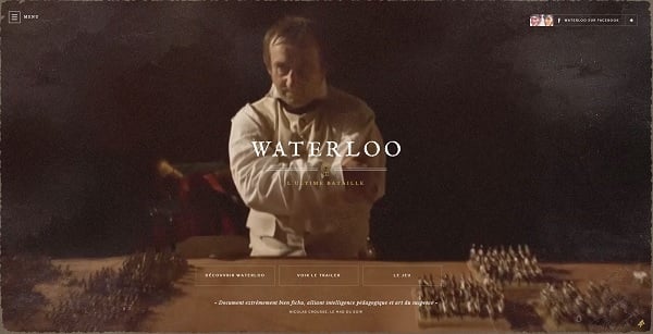
Waterloo le Film
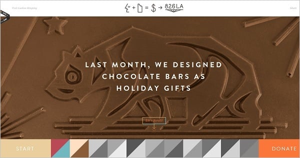
826 LA

Web designers should remember that not every button on the website may be created in hollow style. Mostly such buttons are used for home pages or serve as additions to menu categories. Too many hollow buttons may ruin the overall style of the website and make it look too dull and luscious. It may seem another reason against hollow buttons, but with reasonable approach design with rare inclusion of such buttons may look exclusive and sophisticated.
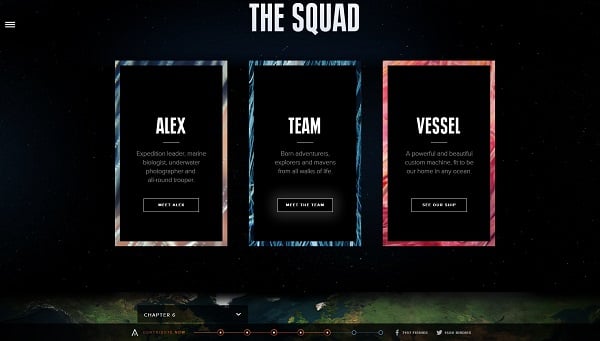
Aquatilis

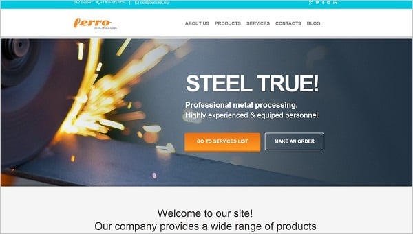
Industrial Website Template
Due to their simplicity and minimalist style more pitfalls appear in empty buttons creation: they tend to look exactly the same on every site. It’s hard to create a unique ghost button with the use of a few traditional shapes. As a solution designers tend to add small decorations around buttons or use unhackneyed fonts to add some personality.
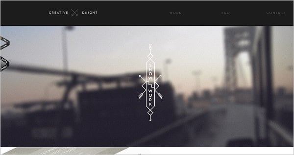
Creative Knight
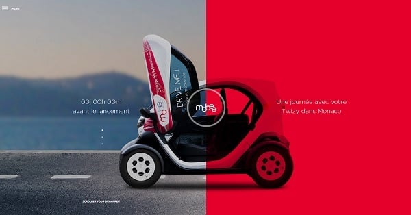
Mobee
In any case, harmony and a happy mean are the main rules in hollow buttons use. If used in a right place, created in a proper style, ghost button may add elegance and modern look to the website design.