

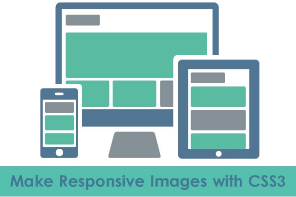
How to Make Responsive Images with CSS3: Complete Guide

With the proliferation of mobile devices, it’s quite hard not to keep a website work impeccably across a variety of screens. For the past few years, the growth of mobile has exploded quite impressively, making online players competing to make the most logical use of this technology. By reaching customers through their mobile devices it becomes really easy to create interactive and innovative customer experiences.
Owing to the rise of mobile Internet, online firms are dealing with questions like how to build a website suitable for all kinds of users. The answer to this lies in responsive web design.
An Overview of Responsive Web Design
Responsive web design is a practice of creating a website which works gracefully across a variety of devices. The design is a perfect mean to make a website compatible with every device, regardless of the size, platform, orientation, resolution and so on. Responsive web design is aimed at providing a satisfying experience to the user irrespective of the varying view port sizes.
A responsive web design can be implemented in a variety of fashions such as using srcset, HTML etc. The methods vary on the level of complexity involved and browser support. However, if you want to build a responsive website using a simple method, then CSS3 is what can help you accomplish your goal. In this guide, I will explain you a complete process of creating a responsive design using CSS3. The tutorial is easy to follow, and will surely help you in creating a better user experience on the mobile.
Make a Simple Responsive Image
Let’s begin with a very simple and basic example. First of all we need a regular which we want to make responsive. Also, we have ‘div’ which acts as a container.
<div class=”container”>
<img src=”picture.jpg” width=”950″ height=”640″ />
</div>
Now, you can see here the container with the ‘width’ property of 95%, so that it could have left and right margins. We have also assigned it a maximum width of 960px, this way the layout won’t look too wide when viewed on large screens.
It is worth noticing that the element within the container is set with 100% width property and it will always remain equal to its container no matter what the size of viewport is, thus making it well optimized for any device. The height is set to ‘auto’ which helps the image scale proportionately.
div.container {
width: 95%;
max-width: 950px;
margin: 0 auto; /* to center the container */
}
img {
width: 100%;
height: auto;
}
It should be noted that the element will keep on displaying responsive behavior even if you keep the height and width of the markups fixed.
Make Responsive Images in Columns
There are times when you feel the need to display images side-by-side in columns. What would you do to achieve this? Okay, let me explain you. Getting responsive images in columns is easy and all you need to do is just lower the CSS width property and set ‘display’ property value of inline-block to elements. Two column and three column are two types of layout schemes.
Let us discuss about both of them in detail:
Two-Column Responsive Image Layout
For creating a two-column responsive layout, first of all, you need to set the width of CSS property to 48% or half of the container. The reason being not setting the width to 50% will give the image some margins on both of the sides.
HTML
<div class=”container”>
<img src=”picture1.jpg” width=”950″ height=”630″ />
<img src=”picture2.jpg” width=”950″ height=”630″ />
</div>
CSS
img {
width: 48%;
display: inline-block;
}
Three-Column Responsive Layout
The approach of creating three-column responsive layout is the same except that here you need to set the ‘width’ property to 32%.
HTML
<div class=”container”>
<img src=”picture1.jpg” width=”950″ height=”630″ />
<img src=”picture2.jpg” width=”950″ height=”630″ />
<img src=”picture3.jpg” width=”950″ height=”630″ />
</div>
CSS
.three-columns {
width: 32%;
display: inline-block;
}
Make Responsive Images with Conditional Break Points
It might be beneficial to define breakpoints on the basis of device classes, products, or operating systems for a better experience. Conditional breakpoints can be displayed in columns, so that whenever the image gets compressed, the column gets shrink automatically too. To do this, we need to make use of media queries.
In the example below, the one-column image will be displayed on Smartphones, two on tablets, four on devices larger than these two.
HTML
<div class=”container”>
<img src=”picture1.jpg” width=”950″ height=”630″ />
<img src=”picture2.jpg” width=”950″ height=”630″ />
<img src=”picture3.jpg” width=”950″ height=”630″ />
<img src=”picture4.jpg” width=”950″ height=”630″ />
</div>
CSS
/* to be rendered on small devices (e.g. smartphones) */
img {
max-width: 100%;
display: inline-block;
}
/* on medium devices (e.g. tablets) */
@media (min-width: 420px) {
img {
max-width: 48%;
}
}
/* For devices with larger screens (e.g. desktops) */
@media (min-width: 760px) {
img {
max-width: 24%;
}
}
Make Full-Width Responsive Images
In order to design a responsive image with 100% of the viewport size, simply eliminate the container’s max width property ( which is 950px) and set it to 100%.
.container {
width: 100%;
}
img {
width: 100%;
}
Conclusion
All said and done. I hope you find the tutorial helpful and will use it as a reference whenever you want to create a beautiful look for your responsive website to cater the needs of your mobile audience.