Inspiring & Trendy Brutalist Websites That Will Make Your Day
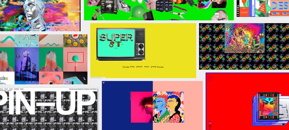
Not long ago the online world burst out with numerous discussions concerning the appearance of brutalist websites. While some web designers name them ugly and useless, others praise their unusual design approach and functionality. So, what is all this fuss over? Does brutalist style have a right to occupy the place among the web design trends 2018? Or is it just a passing fancy without any future?
How Has Brutalism Appeared?
“Everything new is well-forgotten old”, they say. To tell the truth, brutalist style isn’t something completely new. It takes the roots in the architecture of the 1970s with its large buildings with exposed concrete construction. The style was a reaction to the frivolity of the ornamental Beaux-Arts one flourishing in the 1930s and 40s. Though the brutalist buildings weren’t particularly attractive, they were fully functional.
It is believed that brutalist web design began to develop due to Pascal Deville, the creative director at Freundliche Grüsse. He was the person who gave the birth to Brutalist Websites project. To be more specific, Pascal Deville simply gathered various examples of brutalist web design in one place. He sees them as “a reaction of a younger generation to the lightness, optimism, and frivolity of today’s web design”.
Characteristic Features of Brutalist Websites
Although brutalist websites look quite different there are several distinctive features the majority of them possess:
- one-color background (as usual white, black or green);
- unconventional color schemes that are often hard on your eyes;
- monospaced typography that sometimes resembles code visualization;
- absence of the distinct hierarchy;
- simple navigation (though sometimes rather unusual) or even no navigation at all.
On the whole, brutalist web design tends to break the standard rules you are used to. It ignores the basics thus creating a memorable experience.
Is Brutalism Design for Everyone?
Certainly, the answer is negative. As you know, one man’s breath is another man’s death. Scarcely will your online visitors be in raptures from the brutalist design if you represent a serious law or financial organization. On the contrary, if your business is all about creativity, some elements of the brutalist style may perform well. The fact is that today hundreds of brutalist websites actually work and have their loyal audience.
Brutalist Websites That Really Work
Possibly, you haven’t visited any of brutalist websites yet. Then it’s high time to get acquainted with some of them. Even if you’re not going to implement the brutalist design in the nearest future, new knowledge is never redundant.
Wolftone Chambers
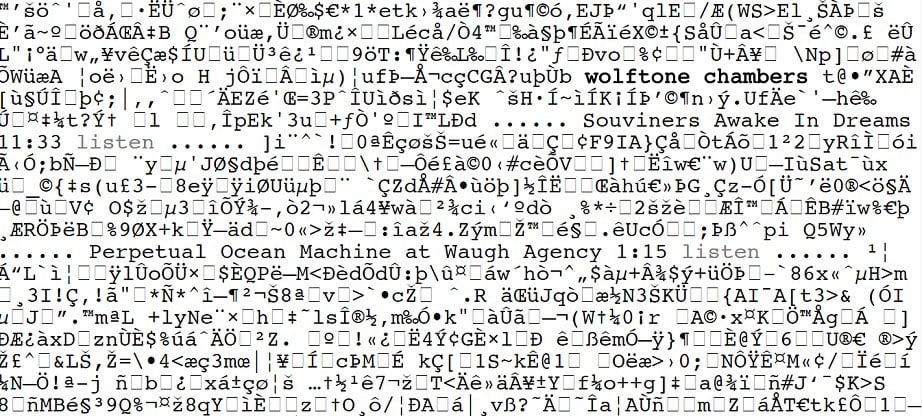
Do you think that Wolftone Chambers is nothing more than a senseless collection of characters instead of the meaningful content? Don’t make hasty conclusions. Look more carefully. There is content here. Plenty of it. Moreover, this content does make sense. As you scroll down the page you intuitively understand how to navigate the website. Of course, you may say that the website isn’t visually appealing and highly functional. However, it works. Besides, no one will deny that its brutalist design is quite memorable.
EMMA
EMMA with its unusual right-hand navigation is another vivid example of brutalist websites. The main block of the navigation repeats along the whole page. What’s more, if you move your mouse over EMMA all the sections are replaced by this word. The entire design seems rather strange until you find out that EMMA represents a “non-profit organization for artistic and cultural contemporary practices”. Whereas such a kind of website may look weird for a lawyer, for instance, it does quite well for expressing one’s creativity.
W.A.S.T.E. Headquarters
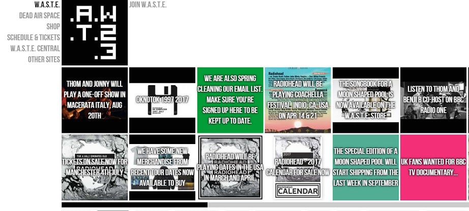
Do you enjoy the songs of Radiohead? W.A.S.T.E. Headquarters is an official website of this English rock band. On the one hand, the content of the grid gallery has no logical organization. The blocks of various colors with large white headings just appear one after another. It may seem that this brutalist web design is testing your patience. On the other hand, the website contains all the information that is of primary importance to the band. You can easily find the tour dates and make a purchase using a simple navigation on the left.
Wek Flat.M
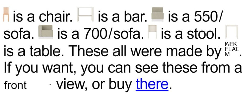
Have you ever seen ecommerce brutalist websites? If no, here is one of them. Wek Flat.M is an online store of the company from South Korea that specializes in furniture. The website is the best example of simplicity alongside with functionality. There’s no any distracting information or annoying ads. Do you want a chair? Buy it. If you need a sofa, well, it’s also here. No search options, no wishlists or testimonials. Just an item, its price and an opportunity of buying it. This website undoubtedly has its own personality.
Paria Radikal
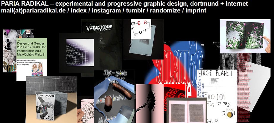
Paria Radikal homepage design resembles the wall of an avant-garde art gallery. So, it’s not surprising that it can either completely grab your attention or make you quit the website immediately. Random visuals (some of them are not static) act as links that take you to various projects. Since the company states their works to be “progressive and experimental” their website design should clearly convey this message. And it does it perfectly.
Craigslist
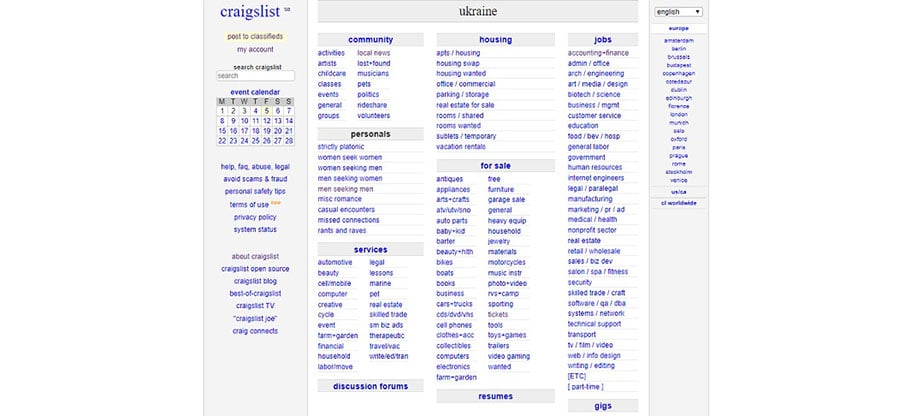
Hardly will anyone call Craigslist with its black text, blue links, and white background “the most appealing website of the year”. However, this representative of brutalist websites may arouse your interest. What can you find there? Almost everything: jobs, housing, goods, services, romance, local activities, advice and what not. Does it look attractive and please the visitor’s eye? We wouldn’t say so. Does it work and have its online audience? Yes. More than 60 million people use it each month in the US alone.
Mary Gaudin
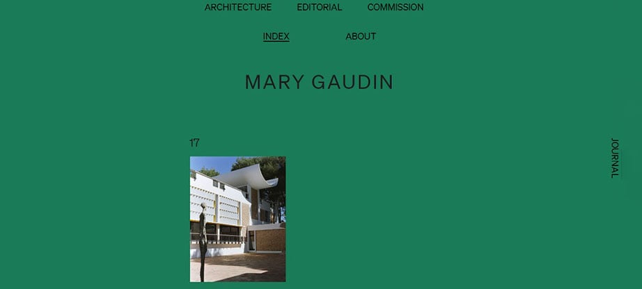
Mary Gaudin’s online portfolio is as extraordinary as its owner herself. As a rule, online portfolios of the photographers are neatly organized. Firstly, it’s considered a great way to showcase their owners’ works in the best light. Secondly, careful organization highlights the artist’s professionalism and aesthetic taste. Mary Gaudin doesn’t follow the common scheme. She makes her portfolio stand out by using a long scroll of asymmetrically placed photos of different sizes. A rather creative brutalist approach, isn’t it?
Brutalist Redesigns
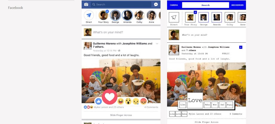
Talking about the brutalist websites we can’t but mention Pierre Buttin’s brutalist redesigns. Do you want to see how one of your favorite apps such as Facebook or Instagram will look without the superfluous flash that adds nothing to the experience? Visit Pierre Buttin’s personal website and enjoy the results of his project “Brutalist Redesigns”. This professional UX-designer tried his best to explore the various styles of brutalism and use them in practice.
Create Your Own Brutalist Website
Would you like to try building a memorable brutalist website yourself? No problem. Choose one of the MotoCMS brutalist website templates and enjoy the process.
Weboo
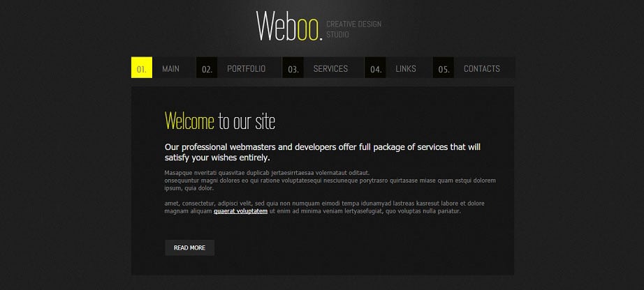
Weboo is a perfect theme from MotoCMS for those who are interested in the effortless and quick creation of brutalist websites. The best thing is that you don’t need any technical skill to make your dream come true. Due to the convenient website creator inside the admin panel, it won’t take you long to fill your website with the desired content. In case the theme seems too elegant for your project, you can easily customize it within a few minutes. Change the color scheme and the font via several clicks and that’s it. Your brutalist website is ready to go online.
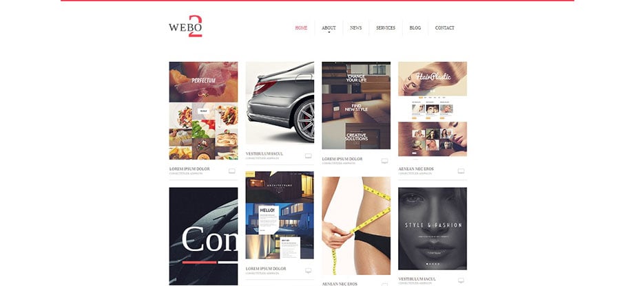
WEBO2
WEBO2 is one more theme from MotoCMS worth careful attention of the brutalist style admirers. Unlike Weboo, it makes images the core of the website design. Grid gallery that occupies the home page of the template will definitely grab the attention of your audience at once. Just take your mouse and drag-and-drop all the images you need to the layout. A free 14-day trial period will enable you to ensure that you’ve made a right choice. Besides, whenever you have any questions you’re free to contact MotoCMS 24/7 professional customer support team. Believe, these guys will never let you down.
Bottom Line
Tastes differ. So, it’s up to you whether to love, hate or just ignore brutalist websites. However, as long as they work and attract the online audience they definitely have the right to exist. Perhaps, you have your own thoughts on the subject? Please, feel free to share them in the comments section below.


