

Psychology of Logo Design: What Does Your Logo Say?

Before we look into the psychology of logo design, let’s see what the term ‘logo’ actually means. The term ‘logo’ is derived from the Greek word ‘logos’ which means ‘word’. Designing a logo literally means creating a visual representation for a ‘word’ or ‘words’ that speaks to people about something.
How People React to Logos
Extensive studies and research has shown that people connect to your logo in different ways. The point of the psychology of logo design is that people from different backgrounds, with different education and even from different geographical locations, can perceive your logo in different ways. They can interpret the meaning in different ways. Hence, it is imperative for businesses to work on each and every aspect of their logo so that they can be sure of the message that is being conveyed.
Every business tries to get a logo design that is recognizable, memorable and reflects their brand’s story. The logo symbolizes the business. When consumers shop, scanning the shelves and trying to choose from a multitude of the same product, the logo design equipment is what helps them decide. It tells them that they’ve made the right choice.
Logo Templates
This is one of the reasons why smart businesses never go for a logo made from a logo template. Instead of going for something that’s already been done before, the best designers seek to understand the business and create a unique brand that symbolizes it considering the psychology of logo design. They try to make logos that convey deeper meaning. You will find a lot of companies that have logo origin stories.
Unique Logos Matter
Businesses know the importance of a logo, what they don’t get is that their logo has to be unique as well. If you are a mobile or tablet manufacturer, just getting a logo that is designed like Apple’s logo doesn’t get you the effects that you were looking for. In fact, it exposes you to a potential lawsuit while failing to stand out in the market.
Get It Just Right
Whether your logo is designed from a premade template or designed creatively by a designer, it will convey some kind of message to the customers. That is why everything about the logo needs to be intentional, well thought of and tells the story that you want it to tell.
Let’s delve deep into the psychology of logo design and find out how the colors, fonts, shapes, lines, and composition affects your target audience into buying your product or services.
The Psychology Of Fonts
Fonts have a greater impact on the psychology of logo design than we know. The shape of the letters, the spacing, and the font choice elicit a direct response from us. Choosing the font with the right ‘personality’ can work wonders and choose hastily or unknowingly can have an adverse effect on not only our sales but our overall company image.
Fonts show off our company’s personality. Websites that use a lot of fonts tend to give confusing or mixed signals to the visitors and that results in people leaving the website as they couldn’t make up their mind.
Sans or Sans Serif
Some businesses go for the Serif or Sans Serif fonts. These fonts were specifically designed so that people would understand the words written. That makes these fonts good choices for almost all types of logos.
Traditional
Maybe you would rather go for something conventional and old-school like Arial or Helvetica. Or if you have an antique store you might like to have a strong and offbeat font to represent your company like Kirsten or Papyrus.
Fonts and Their Personalities
A study conducted by the Software Usability Research Laboratory (SURL) at Wichita State University on the psychology of logo design observed how different fonts associated with different personality traits that people had.
Conventional fonts like Arial or Times New Roman were found to be ‘stable’ and ‘mature’ but were also found to be ‘mundane’ and ‘conservative’. The fonts Comic Sans were found to be ‘invigorating’, ‘casual’ and ‘happy’.
So, for example, if you have a law firm, you should definitely stay away from the Comic Sans fonts, no matter how much you personally like it. It will give customers entirely the wrong message. But if you are a coffee shop that wants to explain to the visitors that you have a relaxed and comfortable atmosphere, you can go for Comic Sans. What you should avoid would be Arial or Times New Roman as it will give you negative markings.
No matter what font you choose for your logo, just make sure that it is readable and your company name is prominent. You would be surprised to find out how many companies are out there whose logos are pretty hard to get. How will people remember you if they don’t even know your name?
Psychology of Logo Design – Fonts and Their Shapes
Every logo that you see has a shape, whether it’s just a name, an icon or a mixture of both. Just like fonts, shapes also convey messages to the viewers and they have their own associations that they transfer to your brand once you select those shapes.
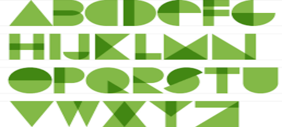
Shapes fall into three major categories—organic, geometric, and abstract or symbolic. Here’s what you need to know about the psychology of shapes to create your own logo.
Geometric Shapes
These shapes include squares, circles, isosceles triangles, and others. The important thing about geometric shapes is that they are all precise and give off a man-made look. Using these shapes signals power and order.
Squares and Rectangles
Squares and Rectangles are always perfect. They have four sides. In a square, all four sides match each other and in a rectangle, two opposite sides match. This conveys stability, order, strength, and reliability. If you want your logo to convey these emotions, try to incorporate these shapes into your logo.
One example of using squares and rectangles in a logo is the IBM logo. The company’s full name is ‘The International Business Machines Corporation’. That was later shortened to give a more powerful and minimalist sense. IBM logo has a lot of rectangles making up its logo. This invokes the feeling of trust in people.
Circles
Circles neither have a beginning nor an end. They are endless. Integrate circles in your logo if you want your consumers to feel eternity, timelessness, and harmony. Curves are often related to the feminine structure and hence, circles also communicate delicateness, gentleness, softness, and femininity.
Triangles
These shapes are directional. They are always pointing towards something. Depending on their position, they convey different meanings. If you use triangles with their right side up, you will convey the feelings of power, upward motion, and ascension. Using an inverted triangle means instability and obviously, downward movement or decrease.
Triangles that are pointed to the side are a little bit tricky as they convey movement to the side which they are pointing at. Most western languages start from the left and move to the right. So a triangle pointing to the right might mean forward movement, but the same right-sided triangle might mean the backward movement is shown in a place where the language goes from the right to the left. Use them with the utmost care.
Psychology of Logo Design – Abstract Shapes or Symbols
Abstract symbols and shapes usually represent some concrete ideas in cultures. They have clear and common meanings and usually a story behind them. One symbol or an abstract shape can convey a world of information in the psychology of logo design.
These shapes are common and most people have seen them time and again. This way if you use these shapes in your logos, you will find that people will easily recognize them and act accordingly. But make sure that you do so in a smart way. On the one hand, these shapes help people associate a strong emotion with your logo, but on the other hand, they can also make your logo seem unoriginal and clichéd as these shapes have been used time and again by a lot of people through a lot of mediums.
Arrows
Suggest movement in a specific direction and travel. Businesses like Amazon and FedEx use arrows to send this subliminal message to the viewers.
Hearts
These are the most commonly understood symbols of all. Unfortunately, these are also the symbols that have been used a million times in a million different ways. Hearts represent love, relationships, companionship while broken hearts represent breakups and sadness. Some examples are the American Heart Association, I Love NY and Airbnb.
Stars
Stars can convey different meanings psychology of logo design depending on the way they are used. They can give the feeling of patriotism, religion, or even relate to show business and Hollywood. There’s the famous Hollywood walk of fame that has stars with the handprints of famous actors and actresses. The USA Flag has stars.
Although these symbols and others can be cleverly used in logos, they also come with the risk of your business losing its originality and becoming part of the noise. Since these symbols have been used time and again, using them now might have the opposite effect than what you were trying for.
If you still want to use them, go for something that is hidden and subtle like the FedEx logo. They have created an arrow in the negative space which is a surprise for people when they first lay eyes on this logo and hence make a strong association with the logo and the company.
Amazon’s logo is the same way. It’s not subtle like the FedEx logo, but it serves up a trifecta of messages for us.
- Package delivery
- Range of products (from A to Z)
- The resultant smile of the recipient once they get the packages
Organic Shapes
Organic shapes are the ones that do not have a definite or regular shape or pattern. There are no exact dimensions to their curves or angles or lengths. These are shapes that we usually find in nature. For example, the shape of a tree or a leaf, the formation of rocks, or something natural, random and free.
Non-symbolic shapes that are not made by nature are also categorized here. Here are a few things to keep in mind when using organic shapes in the psychology of logo design.
Natural Shapes
Natural shapes like grass, trees, leaves, representation of water have a soothing effect on the viewer. If you have a spa, a clinic, or something like that, go for these shapes in your logo. They will have the desired effects in the psychology of logo design.
Angular Shapes
Angular shapes are a risk to use. For a long time, humans have associated sharp and angular objects with fear. These shapes are usually associated with weapons that are sharp or animal teeth. Using these shapes in your logo might have an entirely wrong impact on your viewers.
Random Shapes
Shapes that don’t resemble anything or any known symbol are open to interpretation. If you want to use these shapes in your logo, make sure that you make the entire logo in such a way to communicate your message clearly. Do that with the other elements in your design.
Psychology of Color
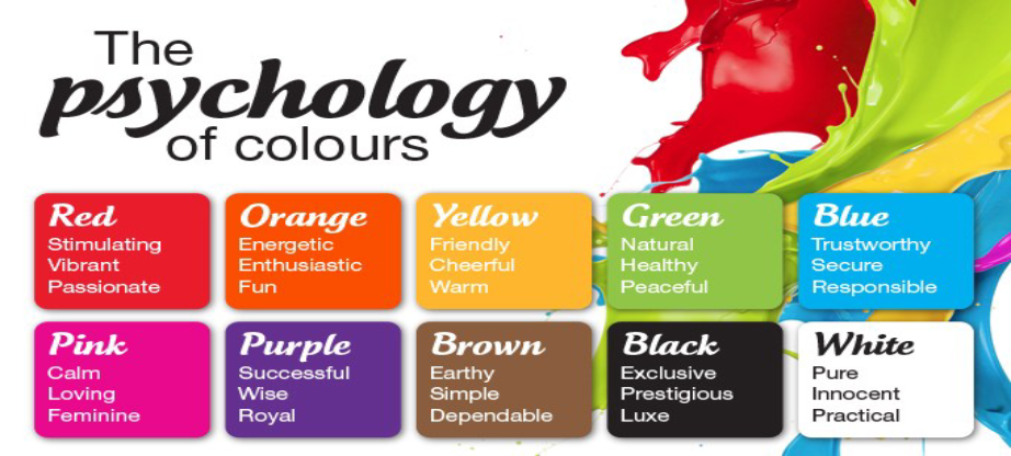
The role of colors is the most underestimated element in logo design. Not just companies, but also logo designers don’t pay much attention to it due to the presence of vibrant colors in the market. Apart from this noise, some people ask the logo designer for a specific color in their logo because they like it or they think it will shine in the logo. The result is a logo that doesn’t affect the viewers like it should have.
Humans by birth are attracted by colors. Just let a child lose among a big box of colors and some paper and watch him entertain himself for hours. Little kids are always trying to grab the most colorful thing that they can reach for. This fascination with colors does not ebb with time. Colors invoke strong emotions in us and add brilliance to everyday things.
Just like everything else, colors also lend emotions to logos. All you have to do is to visit a mall and you will be bombarded with all types of colors. The important thing here is that only a few of them will actually have an impact on you and you will feel them pulling you towards the brand that they represent. Some will be subtle and quiet and others screaming, all vying for your attention. Let’s see what each color represents.
Yellow
The one thing that people immediately associate the color yellow is the Sun. People associate the Sun with daylight and hence, yellow color evokes the feeling of optimism. This is the reason why this color brings out feelings of warmth, comfort, light, and clarity. It is also associated with things like treasure and gold. Gold is also yellow in color, hence the relation with gold and everything shiny.
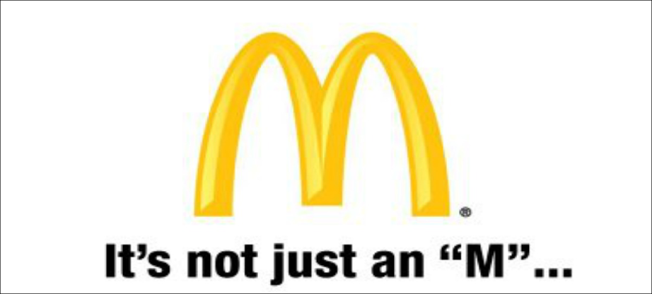
Yellow is also a bright color so it stands out no matter which environment you put it in. Different companies use this color in different hues to achieve their target. For example, McDonald’s golden arches represent a kid-friendly place that is fun to be in.
UPS uses the color in its shield. In the psychology of logo design, it makes the logo and hence the brand looks dignified. CAT uses color in a totally different way. Since it is a manufacturer of machinery, engines, and construction and mining equipment, they have used yellow to represent optimism and joy. Their story is that using their machines will bring joy and you will feel elated once the job is done as it will be perfect.
Orange
Orange is a color that always stands out no matter where you put it. It screams for attention and always gets it. You cannot pass a window that has orange in it and not focuses on it. It evokes the feelings of youthfulness, creativity, and enthusiasm.
Harley Davidson uses orange in its logo. Combining it with black color gives it a rebellious look. The logo is not only attractive but also tough. That is what Harley Davidson is all about.
Orange is also kid-friendly. The best example is Nickelodeon. The orange splatter grabs the attention of young minds every time. Similar effects have been recorded by Fanta and Crush orange sodas, although they use the orange color to associate themselves with the fruit orange.
Red
This color in the psychology of logo design is responsible for raising people’s pulse rate. It produces a host of emotions in people like love, warmth, excitement, sexiness, danger, blood, romance, roses and urgency. This is one of the reasons why designers use this color with caution. If you want to design a logo with a red color, you do not want to use it to convey excitement and end up conveying danger.
This color is used most in the entertainment industry. Companies that have used this color successfully are Nintendo and Netflix. Target also uses this color to evoke a feeling of urgency in people. This color compels people to buy things, especially if there’s a sale. Coca Cola also uses this color to convey excitement mixed with affection.
Purple
This color has, for a long time, been associated with royalty. It brings up images of grandeur and mysticism. It also speaks of wisdom, wealth and power. If you have a brand of luxury watches or luxury tours, you will do well to use this color in your logo.
For all the people, quality of life matters more than anything. Everybody wants to raise their quality of life. Hence, people always go for experiences that will take them out of the ordinary, even if it is for a few moments. Brands use purple color to attract such people like that.
One example of this is the Syfy channel. From the point of view of the psychology of logo design, the color purple is perfect for a channel that deals with the impossible.
Another excellent example of a brand using this color to further its image and message is the company, Hallmark. They use the purple color and the crown on top to show royalty as well as wisdom.
Blue
Blue is the color of peace, calmness, and tranquility. If you don’t believe us, just look up at the sky (in the morning of course) or go out and look at the sea for a few minutes. It also conveys strength and dependability.
This color is used a lot by tech companies to convey the feelings of trust and dependability in their products. Examples of logos that use blue are IBM, Dell, Intel, GE, and Ford.
Green
Earth is a mixture of two colors. Blue and Green. People feel serenity and peacefulness when they look at the green.
If your brand deals with the environment then this is definitely the color for you. If you are running an NGA, or an organic food company, take advantage of this color in your logo. Green is also associated with good health.
Black and White
Even though these two are not colors (technically), they are used and liked for the personality traits that they give. Black is the absence of color and white is a combination of all colors.
The black color gives the image of professionalism and credibility. It can also be used to describe something edgy, or rebellious or extraordinary. White is pure, innocent, sweet and angelic.
Nike uses a simple sign-in black to tell everyone that they mean business. Also, they use this color to evoke edginess. Their shoes are out of this world and they let everyone know it.
Psychology of Logo Design – Successful Examples
Some logos use the combination of colors, shapes, and fonts to help them successfully stand out from the crowd.
Trip Advisor
The owl in the logo represents wisdom and the color of the eyes-green and red- represents the signal. Green for a go and red for stop.
Mastercard
They have used color psychology to the maximum. Red stands for bravery, passion, and joy, while yellow represents prosperity. These are the feelings that they want to evoke in their users.
National Geographic
National Geographic is one of the most popular magazines and channels. Their logo, in the psychology of logo design, is a simple rectangle that symbolizes an open door that represents knowledge and wisdom for everyone. The color of the door also represents the Sun which shines over all the planet.
When designing a logo, make sure that you keep these things in mind so that you can have a logo that tells the story of your brand to the people and attract the target audience and compels them to buy from you.